Block patterns are becoming more and more popular with the block editor in WordPress.
They are great ways to add cool sections of content to your post or pages quickly and without a whole lot of work from you. And in fact the WordPress block pattern directory continues to grow with new patterns every day.
So you’re probably going to want to take a stroll through the block patterns hosted there to see if there’s something you might be able to use on your website. And it might be a bit overwhelming at first. After all, there’s just about anything you could want available to use on your website.
So to help get you started, here are some of my favorite patterns that are in the block pattern directory to use on your website.
What to look for in a block pattern
Before we get started, I do want to take a moment to discuss what you should be looking for in a block pattern to use on your website. This can help you narrow down your options until you find exactly what you need.
First, you need to only look for block patterns that you need. I know that seems quite self explanatory, but it is true. You don’t need to look at block patterns that you don’t need to use for your website. So if you’re looking for a services pattern or maybe a pattern for a pricing table, don’t worry about blog posts.
Next, make sure that it can be changed to match your branding. Most of the patterns in the pattern directory are built with core blocks, and with the color controls that are currently available, should be able to work with your brand’s colors and typography. But just make sure to double check that. You don’t want to be stuck with a pattern that has a yellow background when your business’ colors are blue and green.
Finally, check the pattern for responsiveness. Make sure that it looks good as you go down in screen size so that it looks good on your phone and your desktop computer. The good news is that the pattern directory allows you to play with the screen size for the block pattern in the browser, so it’s really easy to check that.
Some of my favorite patterns from the directory
So now let’s dive into some of my favorite patterns from the block patterns directory to help you start to find what you need for your website.
Pricing Table
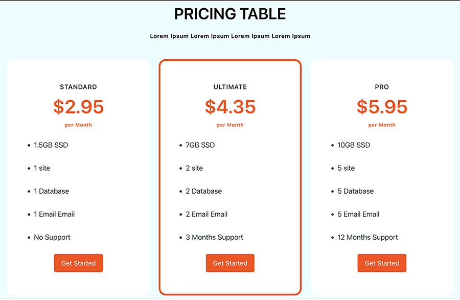
If you sell services or something that might have a range of prices with different features at each level, you’re probably going to need to have a pricing table to make that information easy for readers to digest.
And this block pattern makes it super easy to do just that.
This table is super simple and clean and presents all of the information about each price option in an easy-to-read manner. The colors are customizable to match your branding.
Also, it’s easy to add as many list items for each feature as you want. And the button at the bottom will work with the default WordPress button block or you can change it to add a shortcode for an “Add to Cart” button for WooCommerce or Easy Digital Downloads.
I will say that the sections do look a little weird when you start to get towards the breakpoint, but that’s more of an issue with the default columns block that could really use better responsive controls.
But overall, this is the best pricing table I’ve been able to find in the block pattern directory.
Our Services

If you sell services, you’re probably going to need a way to be able to display what you do. And this block pattern allows you to show what you do in a really cool way.
The formatting of the grid is really clean, and I love the use of the slightly lighter black color as the background for each service to give them visual separation from each other and the main background.
The icons are a great touch too and allow you to add a little pop for each service. They are each an image block, so you can change them out for your own icons if you want. Or you could use something like Nick Diego’s Icon Block to add icons there as well.
The one drawback is that if one of your features has a lot more text than the ones around it, it might throw the grid a bit out of whack visually.
Still, you can’t really go wrong using the Our Services block pattern for your homepage or service landing page.
Six Columns Services With Button & Border
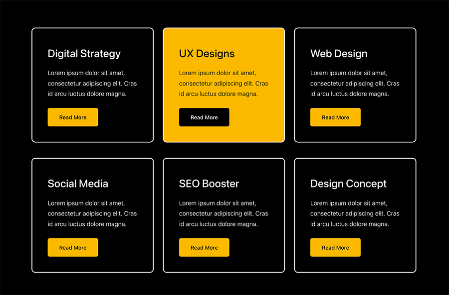
Now if you want something a little bit simpler for your services section, you’ll want to give this block pattern a try.
There aren’t any icons to go along with these services or features, but that’s okay. I love how simple this pattern is, and it can work with just about any website type out there.
Plus, not having to stress about picking out the right icon and trying to make them all look just right can be freeing, especially if you’re trying to build something quickly.
And since it has a simpler design, it will be easier to make it all fit into the style of the theme you’re using.
3 distinctively separated steps with description, image and button
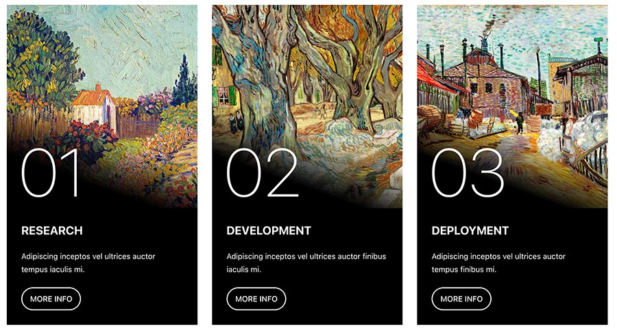
Now if you really want something that’s going to pop off of the page, you’re going to want to take a look at this block.
This is definitely an advanced block pattern, and it’s going to take a little bit of playing around with to make it work with whatever page you’re trying to add it on to.
I love the use of the images to catch the eye of the reader and the gradient down to the text below to make it readable. Like it’s legitimately stunning.
It’s built to be like step-by-step directions on how to do something, but with a little bit of tweaking, you could make it to be like a services or features section.
Getting this to work with the page is going to take some time and effort, but with this pattern, that hard work is going to be rewarded with a great page.
Feature
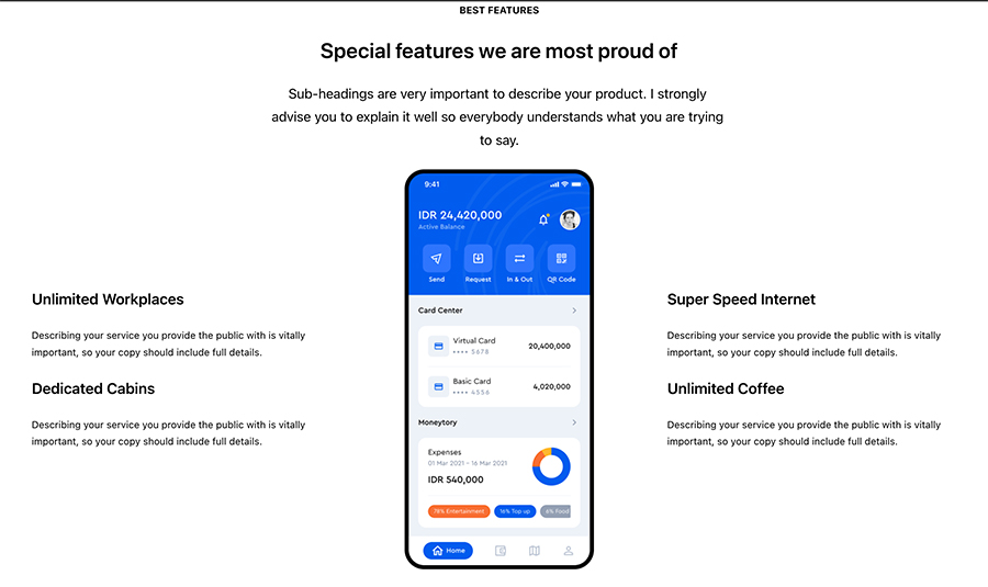
Now if you have an app or another piece of software that you’re trying to sell, this pattern might be the one for you.
This pattern allows you to show a screenshot of your software or product in the middle while you put features and descriptions around the outside of it. It’s really similar to what you might see on an Apple landing page or other software product page.
It’s a great way to show off what your software or app does and how it can help people. And it’s a pretty easy pattern to set up on the page.
I will say that it can look a little odd at smaller screen sizes, as a lot of the patterns do until we get better responsive controls for blocks.
But overall, if you’re trying to show your new app in the best way possible, you’ll want to take a look at this block pattern.
Full Width Banner With Overlap boxes

This one is another really cool features or services block pattern that can pop on your page.
My favorite part is the split color background that can be eye-catching when the user is scrolling. And the different color backgrounds for each service or feature can really add something to the page.
And the buttons at the bottom work with the regular button block or an “Add to Cart” shortcode for a product if you want.
I will say that you’ll probably want to make sure that the columns block for each row is aligned wide so that there’s better spacing with the blocks. Otherwise it feels pretty cramped.
Still this is a great block that can be a good addition to any homepage or landing page.
Gallery
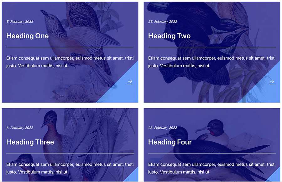
Now this is a really cool block that’s going to add a lot to any page you put it on.
I love the use of the background images and the gradient color overlays on top of the image. It can really add a lot to a page and catch the eye of the reader who might just be skimming the page.
It would take some work to get just right, but I really think this would look exceptional in a grid query for your latest blog posts. It’s possible and it would take some hard work, but man would that look just amazing if you can get it right.
This is a great, versatile block that can work with just about any website and any page.
Recent, creative blog post with title, description and 3 post
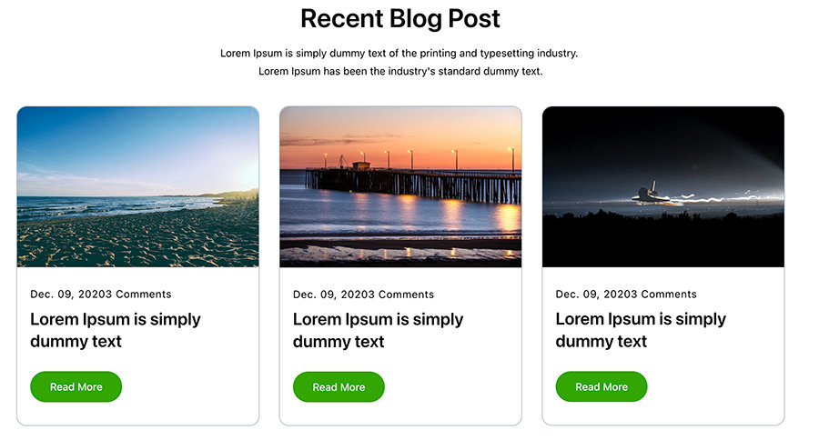
Another query block pattern that can be a great addition to your page is this block pattern.
I love how simple and easy to read this type of layout for blog posts is. This type of styling for posts can be tricky to do with PHP and CSS, but this pattern makes it really easy for anyone to add to their website.
You should be able to change the rounded edges styling to be more straight if you want. And to be honest, I would probably not have the comments heading there unless discussion is a big part of your website.
Still, this is a great pattern that can be used on the homepage of basically any website.
Contact us design/Footer section design

Next up is this really cool contact us or footer section pattern that could be a hit for your website.
I’m a huge fan of the split color background. It really draws a lot of attention to this section, and you should be able to change the colors to match your branding.
I also really love the way the form looks; however, there really needs to be a label element so that it conforms to accessibility standards.
The address and phone number sections are really nice touches, although depending on the best way to contact you, you might end up needing to add an email address section as well.
This pattern is a great way to close out your homepage or really any page on your website.
Blog Post Gallery
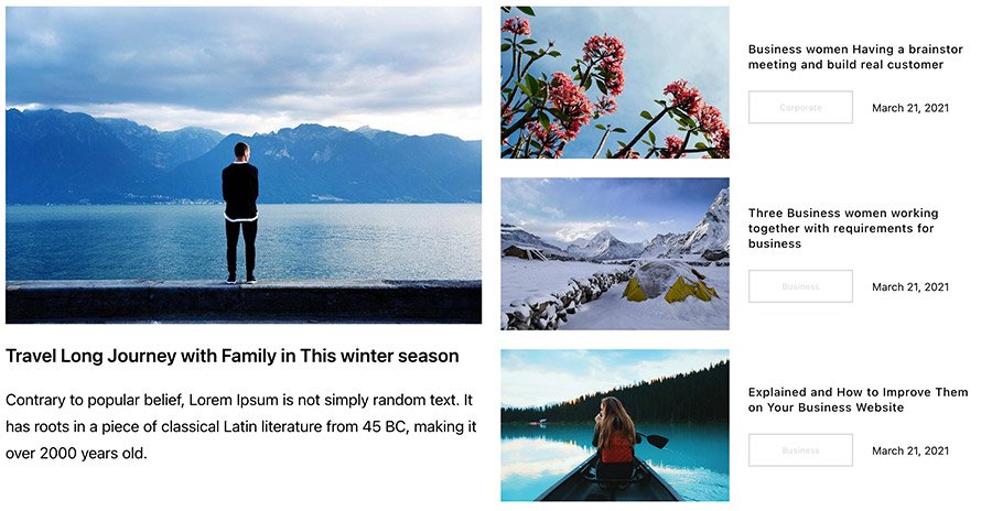
Finally, this query block pattern is absolutely exceptional.
This is a really cool way to show off your latest blog posts and hopefully get people to click on them and read them.
I’m a big fan of this type of layout for blog posts on a homepage and have done it a few times here on this website in the past. But they were always a bit of a challenge to get just right, even for an experienced developer like myself.
But this pattern makes it super easy.
It’s also a great way to call attention to a core blog post that everyone should read.
The one thing that I’m not a big fan of with this pattern is the button-type styling for the categories. It feels unnecessary and out of place. I would just go with normal text there.
But otherwise it’s a great pattern and can be a great addition to your homepage.
Submit your own block pattern
Now, if you want to try your own hand at creating a block pattern for others to use on their website, you can submit your own patterns to the directory as well.
You can go to this page in the pattern directory which will give you a version of the block editor to create your own pattern and submit it right there. Seriously, the only thing easier to submit to WordPress is photos for the photo directory.
This can be a great way to play around with and learn web design in a low risk environment. You can try things out, mess things up, restart and find what works the best without messing up your website or others seeing it.
And it’s a great way to get started contributing to WordPress! So if that’s something that interests you, give it a shot today.
Get started with block patterns and the Crosswinds Framework today!
Ready to start using a block theme and patterns on your website? The Crosswinds Framework can help you get the ball rolling on that right now!
The Framework is a block theme that’s built to enhance your WordPress block and site editor experience. It comes with an extensive set of patterns so that you can quickly create pages on your website. Plus, you can customize everything — colors, fonts, headers, footers, any template and more — right from the editor with no coding necessary.
If you’re ready to get started creating and customizing your website right from your dashboard, checkout the Crosswinds Framework today!


Leave a Reply