What is a contact page?
Well briefly, the contact page is a page where people can find ways to contact you to ask questions or leave concerns.
Sometimes, the contact page is the last thing you probably think about on a webpage. But to a visitor, it might be the most important page on your website.
So let’s dive into the contact page to see what you can do on it and look at some quality examples.
Why it’s important
Simply put, the contact page is where people are going to find ways to contact you for whatever reason. In fact, it tends to be one of the most visited pages on the majority of websites. So it needs to look good.
So creating a quality contact page that provides the necessary functionality while also still looking pleasing to the eye is important when building your website. Having a welcoming contact page can set the tone for how you are going to treat prospective customers and eventually paying customers.
Creating a contact form
Creating the contact form is pretty simple, especially if you use a contact
I won’t go into the technical details of creating the form, since it can vary wildly based on what your website is using. Instead, I’ll go over a few of the basic things that the form needs to have.
First, make sure there’s a field or two for the visitor to enter in their name. Then make sure there’s an email field as well, since this is likely how you’ll reply to their inquiry. You could also have a phone number field, although with a lot of things online these days it’s not a requirement.
You could also have a subject field for the subject of the email that’s sent to you when the form is submitted, but again it’s not a requirement. And finally, you have the message field for the visitor to enter in their full question or method.
Also, make sure all of your fields have a label to keep them accessible for those visitors who will read your site with a screen reader or something similar. Creating a great experience for all visitors should always be the goal of your website.
Tell the Story of Your Small Business With a Website
Every small business has a story. And every small business needs a website to help tell it. A website allows people to find you online, serves as a home base for any marketing effort and can help you tell the story of your business. So if you’re ready to give your business its first website or are ready to take your site to the next level, let’s get started on making that happen.
Let’s Get Started on Telling Your Story With a WebsiteOther items to include
But don’t feel like you just have to limit your contact page to just a simple contact form. In fact, it’s a great place to put your other contact information. If you have a phone number that you use, you can place it here. Also, it’s a wonderful spot to put links to all of your social media so that visitors can follow you and learn more about what you do.
Plus, if you run a business with a physical location, this is a great place to show it off. You can add some photos of your business and embed a Google map on the page so people can easily get directions from wherever they are coming from.
Like with everything, don’t go overboard, but adding a few more items can help create a compelling and helpful contact page.
Examples
So now that we’ve discussed contact pages, why they are important and what you can put on them, let’s look at a few in action.
This site
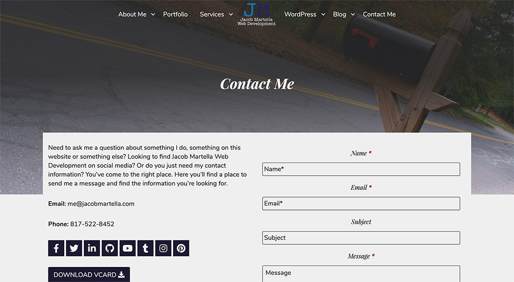
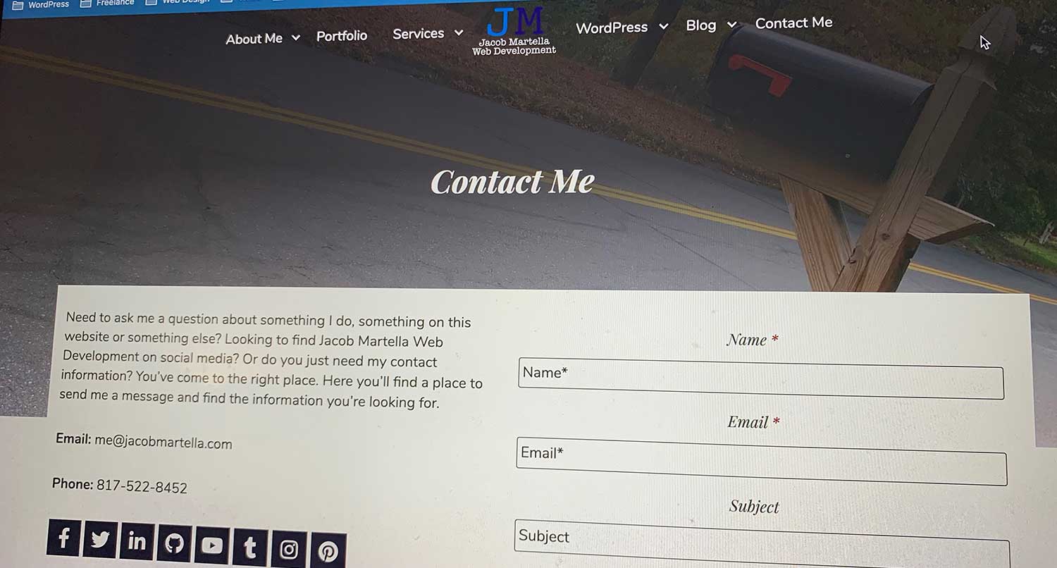
My contact page is pretty simple. The top is like every other page and then I break it into two columns. The first has some text, my email and phone number, links to my social media accounts and even a vCard (Virtual Contact File), which allows visitors to easily save my information as a contact on their computer or phone.
And then I have a simple form with name, email, subject and message fields. It’s simple, but effective.
HubSpot

HubSpot’s contact page is incredibly visually pleasing. It’s so easy to look at this website, and it’s so easy to find what you need on the page. The hero image and overlay is weirdly soothing and it sets the tone for the rest of the page. Plus, the two column layout at the top helps keep the information tight.
Plus, the listing of the offices and the phone numbers is so well done. There’s a lot of information there, but it’s presented in a way that keeps it from being too much. A lot of good web design happening here.
Survicate
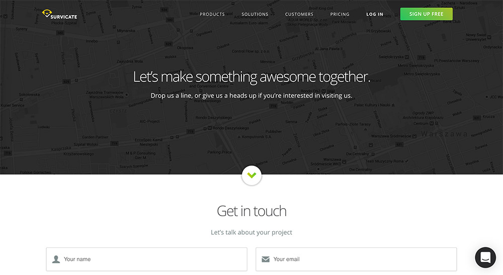
Survicate, on the other hand, takes simple to a new level. There are really just two elements on the page. There’s the hero section at the top. And then there’s the contact form.
It’s so simple, yet so to the point. Sometimes it’s best to keep it simple. People come to the contact page to contact you, so make it easy for people to do that.
Yeah, maybe a phone number would be nice, but I don’t know their business too well. Maybe it just works better this way. Either way, it’s a nice, clean contact page.
So now take some time and figure out how you improve your contact page. If you’re in the process of redoing or building your website, take some of these examples and implement them on your website. Otherwise, look to see what improvements you can make to that page (if you even have one).
You might not think it’s important, but it’s important to your visitors. So take care of it.

