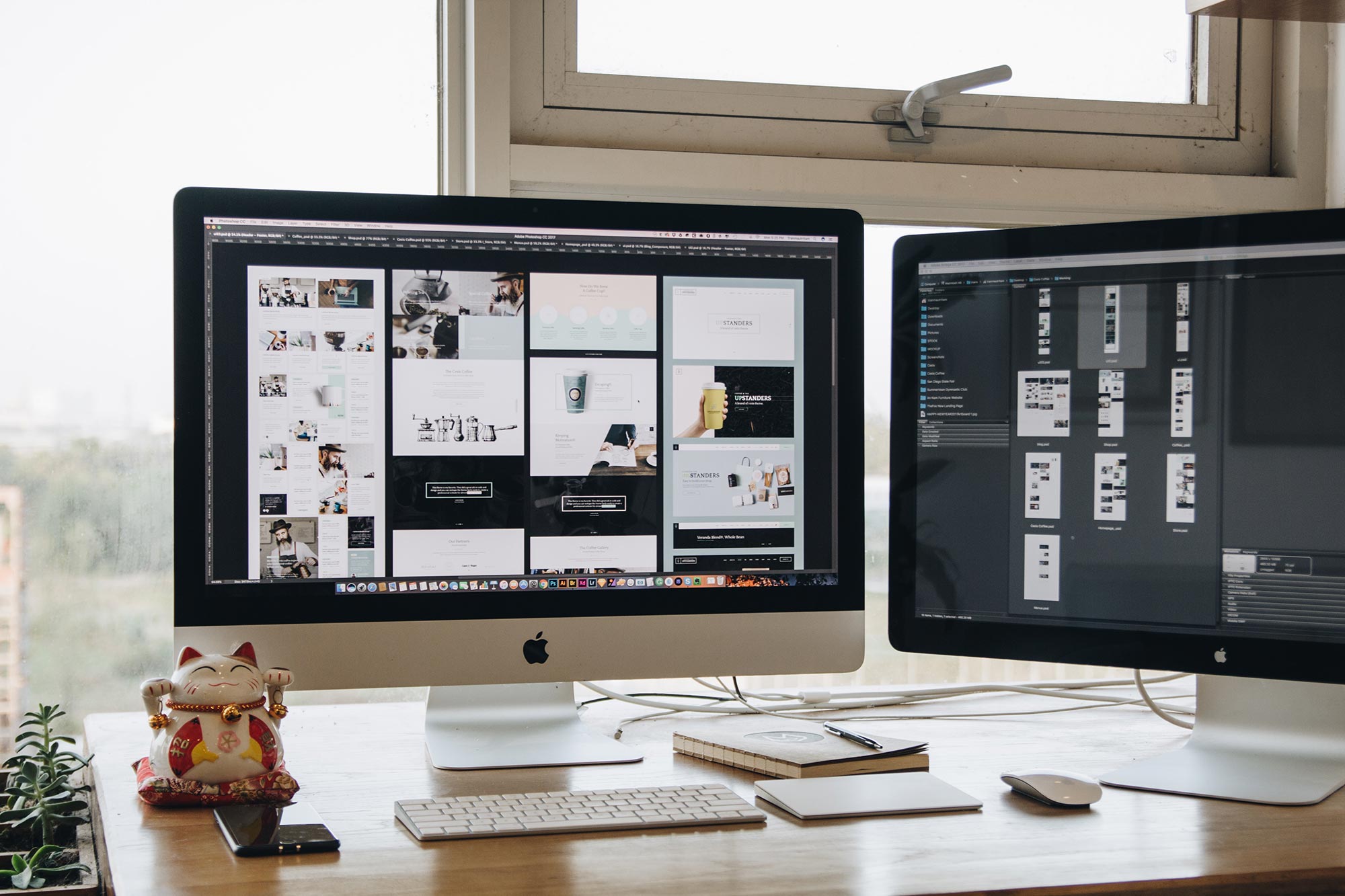
So you’ve just received the new design for your website. You talked with the developer, went through the discovery process, came up with a plan and now the website has a design.
How do you make sure it’s the right look? How do you know that it’s going to help your business bring in more clients and customers?
Well, a website design can be a complicated thing. It’s not just one thing that needs to be right in order for it to work. It’s a set of factors. And the biggest problem is that it, like the rest of the website, needs to last for the foreseeable future.
So no matter if you’re using a prebuilt theme or completely custom website, here are the top items you should be looking at when you receive the design for your website.
How does the content fit into the design?
The first thing you should check the design for is how the content fits into it. The most important part of any website isn’t how it looks, but what it has on it. You can have the most beautiful looking website on the web, but if the content isn’t what it should be, or is hard to read on said design, it won’t matter.
So you definitely want to see how the content fits on the page. Is all of the text readable? If there’s text over images, is there some sort of way to make sure that text is always readable? Or do will you have to do something with the images?
On the subject of images, if there are large images, do you have the ability to take and upload large images? Are the images in clear areas and do they add to the website and not take away.
All of these elements of the content are extremely important. And they should be your top priority when checking a design for your website.
Tell the Story of Your Small Business With a Website
Every small business has a story. And every small business needs a website to help tell it. A website allows people to find you online, serves as a home base for any marketing effort and can help you tell the story of your business. So if you’re ready to give your business its first website or are ready to take your site to the next level, let’s get started on making that happen.
Let’s Get Started on Telling Your Story With a WebsiteIs the design functional?
Next on the priority list is to make sure the design is actually functional. Again, the design can look absolutely amazing, but if I can’t get from one page to the next quickly and seamlessly, it’s a piece of junk.
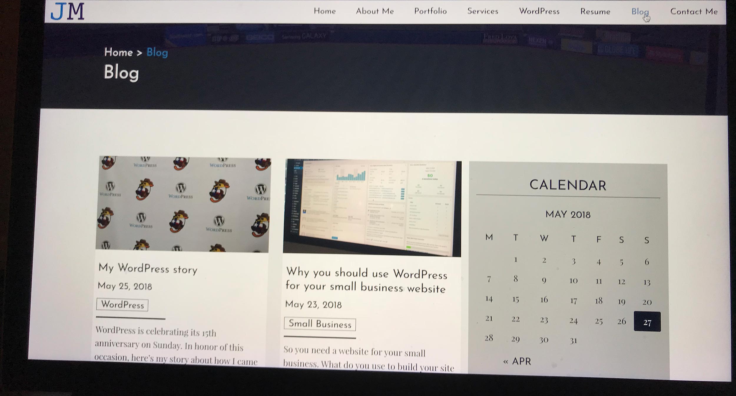
The biggest thing here is to look at the menu and make sure it’s visible and easy to use. Would you, as a user, be able to navigate that menu if you had no prior knowledge to the website? Is it intuitive? Or does it look frustrating?
Also, are other links highlighted in a way that invites someone to click? Is the direction of each page in one direction and easy followable for a user? And are form elements easy to understand and fill out?
These elements have to be satisfied for your website to work. So make sure they are correct before you give the okay for development.
The Design Phase
Does the design look current day?
Finally, we can get to the actual look of the design. Now that we’ve checked the content and the functionality, our focus turns to how the website actually looks on the screen.
Now how elegant the design should look depends on how much you paid, so we’ll think in more overall terms here. Does it look clean and up-to-date? Is it welcoming for potential clients or customers? Does it look like what you paid for?
Also, is your logo somewhere on each page? Do the colors used match the branding for your business? Do the fonts used match your branding? On this one, note that the fonts likely won’t match your branding based on readability on a screen, but are they similar?
Basically, at this stage, is the design what you want your website to look like for the foreseeable future? If it is, then let’s get moving on to the development stage. If not, it’s back to the proverbial drawing board.
So I hope these items help you figure out if the design you’ve received from the designer for your website. This is an important decision, and like any important decision, you need carefully consider all of the aspects of it.
So sit down with the design, review it for these items and make the best decision you can.


