The header is arguably the most important part of any website.
It’s the first thing that you see when you visit a site. And it sets the tone for the rest of the website. Plus it establishes your business’ branding.
A good header is going to let people know who’s website they are on, allow them to easily navigate through your website and create a pleasant experience.
But create a bad header and people aren’t going to stick around for a long time on your website. It’s worth it to take your time when trying to come up with the perfect header.
So today let’s go through what a website header is, what elements make it up and some examples of really good headers you can model yours off of.
Table of contents
What is the website header?
To put it simply, the header of a website is the top section of the site, though sometimes it can be along the side of the page. It’s usually the first thing a new visitor to your website sees and it can really set the tone for the rest of the website.
Typically the header consists of the masthead (or logo or title), navigation, breadcrumbs and social media links. And it may or may not stick to the top of the page as you scroll down. It just depends on the preference of the designer.
Also, the header is likely to stay the same from page to page throughout the website.
Difference between header and hero section
If you’ve done research about website headers, you’ve probably seen some people lump the traditional header with the hero section or top section of the website. I am choosing not to do that. The hero section is usually different enough from the header that it doesn’t make sense to include the two.
Difference between header and head
If you know some things about HTML, you probably know that each webpage has a head section and a body section. The head section is not the same as the header. This section is not shown on the website and it’s where the page title that appears in the tab, metadata is added and JavaScript and CSS is added. The header is shown on the page.
The header semantic tag
Also, if you’ve looked into HTML a bit, you’ve probably seen the header semantic tag. Most website headers are wrapped around this tag; however, it really has no effect on how the page looks. You still need to style it through CSS. It does have some use for search engine indexers.
Learn How to Create the Perfect Website for Your Business
Ready to take the next step towards a new website, but not sure what that next step is? Don’t worry. Download the guide that will walk you through each step of the process so you know exactly what to do to create a website that’s going to help your business grow online.
Learn More About How to Create the Perfect WebsiteElements of a website header
Now that we know a little bit more about what a website header is, let’s go over the different elements that make it up.
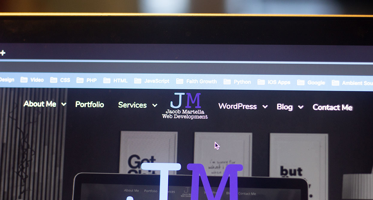
Masthead/Logo/Title
The biggest element of a header is the masthead or logo or site title. Really, they’re all the same thing. Masthead is a holdover from the newspaper term for the top part of the front page where the paper’s name was.
This section lets the reader know whose website they are on. This is where your name or business’ name should go so that people know they are in the right spot. While your logo shouldn’t be really big, you should make sure it’s crisp and professional-looking. This is the first impression of your website.
Navigation
The next biggest element of the header is the navigation menu. This is where people are going to navigate to the different sections of your website.
The key to a good navigation is to make sure it’s properly organized. You shouldn’t have more than eight links that are visible in the menu’s default state. A cluttered top-level navigation is going to overwhelm a reader, which you do not want to do. You can add in sub menu items underneath the top-level items if you need to.
Also, you might want to consider highlighting an important top-level link as a call to action. This could be like “Store” or “Call Now” or “Sign Up”. And you can differentiate it from the other times by giving it a different background color.
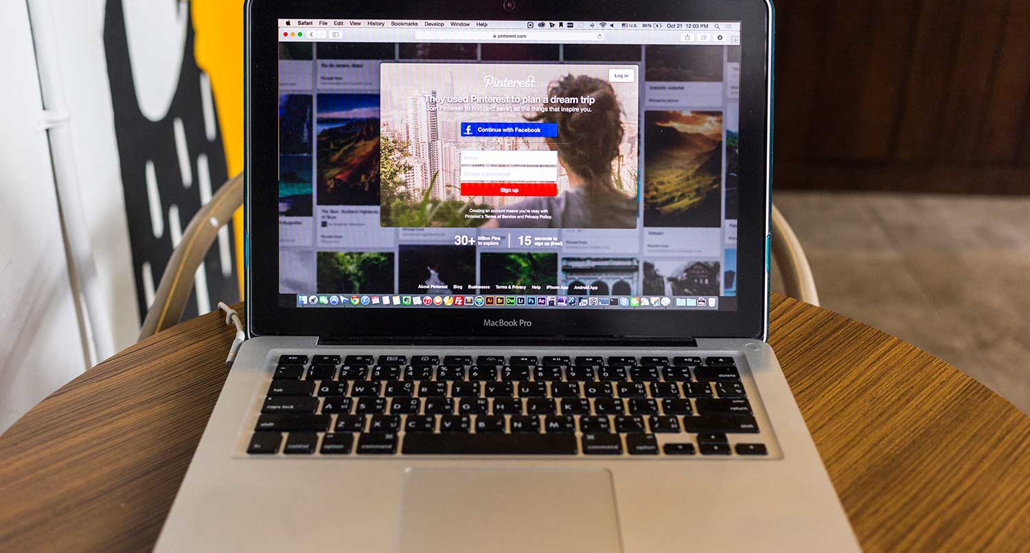
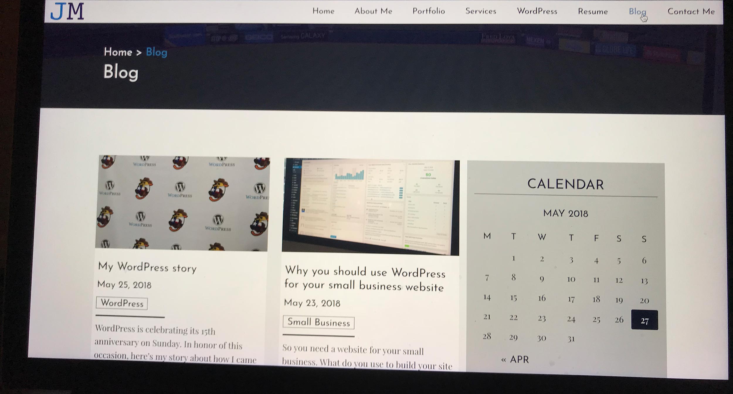
On my Sports Bench website, I have “Buy Now” highlighted with a gold background to draw attention to it and hopefully get people to click it.
Breadcrumbs
Breadcrumbs are an optional element of the header, but they can provide some benefits. This is a section with links working their way back all the way to the homepage. It helps readers understand where on the website they currently are. And it helps them work their way back through the site. And if you use the right schema, they can give you an SEO boost.
Social Media
Finally we have social media links. These aren’t necessarily required, and they can be in the header or in the footer (mine are down in the footer). Normally these are just icons for each social media site. And the more that they fit into the header design, both in layout and color, the better it will look.
To use an H1 tag or not
One question that might come up with the header is whether to use an H1 tag for the site title. As a rule, there should be only one H1 tag per page, both for SEO and accessibility purposes.
I usually make sure that on the homepage, the site title has an H1 tag, but for every other inner page it’s relegated back to the paragraph tag.
But you can do whatever works best for you has long as each page has only one H1 tag.
Schema markup for a website header
Schema is HTML attributes that help Google and search engine crawlers understand the structure of your website, which helps them better index your site. And there are certain Schemas you’ll want to use in your header if you’re crafting it yourself.
The entire header should have the itemtype of WPHeader. The navigation container should have an itemtype of SiteNavigationElement, and links in the navigation should have an itemprop of URL.
For breadcrumbs, the container should have an itemtype of BreadcrumbList and each item should have an itemprop of itemListElement and an itemtype of ListItem, and the link itemprop is item.
If you want to learn more about Schema, you should check out their website that lists every single one.
Create a Professional Website that fits your Budget
Worried that a new website is going to tank your budget? Worry no more. Let’s work together to build a new website that looks great, does everything that you need it to do and doesn’t break the bank. A new website is closer than you think.
Start Now on Building a New WebsiteWhat makes a good website header
So, if a header is so important, what makes a good header? Well, first off it establishes your business’ branding. People need to know that this is your website. Also, it should make it easy to navigate through your website. A bad user experience will have people leaving your website.
Next, it really shouldn’t take up a lot of space. You only have a limited amount of “above the fold” space on screens. And that space needs to be taken up by content that will draw a reader in. So make sure your header doesn’t take up too much room.
What makes a bad website header
On the flip side, a bad header is clunky and takes up a lot of space. It’s annoying and hard to get around and possibly an eyesore. It might even look drastically different than the rest of the website. And it makes it hard to navigate through the website.
Best website header examples
Now that we have a better idea of what the website header is, let’s take a look at some great examples that you might want to model yours after.
New York Times
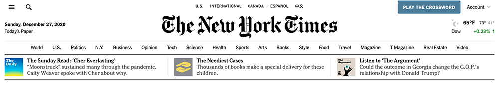
The New York Times has one of the best headers I’ve ever seen. They’ve really managed to bring their physical masthead and seamlessly place it at the top of their website. It stands out, but it also doesn’t take up a whole lot of space, which is key.
It strikes the balance between having a lot of information but not overwhelming the reader or their computer. And having today’s date up there is cool, and has been needed for the better part of the last 12 months.
There are two issues I have with their header. The first is that the ads that appear above it are annoying and weird. And I also don’t understand the sidebar menu that appears for desktop as well. Seems like it should only appear for mobile and tablet screen sizes.
Still, it’s a good website to model your header after.
The Athletic
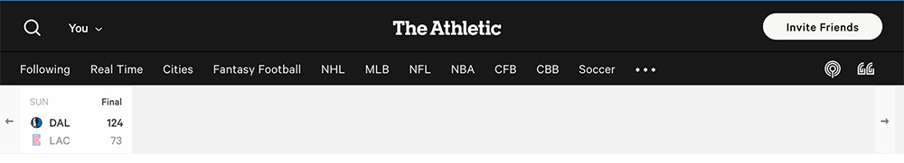
The Athletic also features a wonderful header. It’s extremely minimalistic and it doesn’t take up any more room than it needs to.
I’m a big fan of the way the navigation is laid out. The sports/leagues are all the top-level menu items, but when you hover over them, you get each of the teams beneath it organized into their divisions. It makes it super easy to navigate to the teams I really care about.
Plus the search bar is just wonderful.
The only issue I have with it is that the discussion and podcast logos aren’t necessarily the easiest to understand right away, and I would rather those be typed out.
But overall The Athletic has a great header.
Apple

Next up on the list we have Apple. If you want to talk about very minimalistic headers, this probably tops the list.
You know right from the start that this is Apple’s website, which is great branding. It definitely doesn’t take up a lot of space, and it’s super clean and easy to look at. And it’s pretty easy to navigate around the website.
The only issue I have with it is that the bag icon might not be immediately intuitive that it’s your cart. But that’s also kind of a minor nitpick.
Still, if you can pull it off, going down Apple’s route with your website header might be a good decision.
The Prince Ink
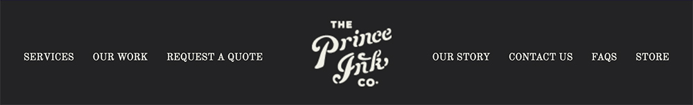
The Prince Ink is a radically different header from the other ones I’ve already talked about, and that’s why it’s on the list.
I’m a big fan of having the logo in the middle of the main navigation. It’s a cool little design thing, and I had it for my website for a year or so. And they pull it off flawlessly.
It’s about the right size for a header, but I do have an issue with the font size for the navigation. It could be a couple of pixels better to increase readability.
You can’t go wrong with modeling your header off of The Prince Ink.
Postbox

Finally we have Postbox. This is an extremely simple website header design.
I really love the simplicity of the menu. One common issue a lot of people have with their menus is that they try to add every page under the sun to the top-level of the menu. You don’t need to do that. And Postbox shows you why.
That being said, the movement of the menu nor where it disappears on the page. It either needs to not move or just stick to the top of the page.
Still it’s a good reminder that a great main navigation does not need a ton of items.
Create your great header
So are you ready to design a great new website for your business? Great! I would love to help you out to design the website of your dreams and something that’s going to help your business grow. And we can get started today.