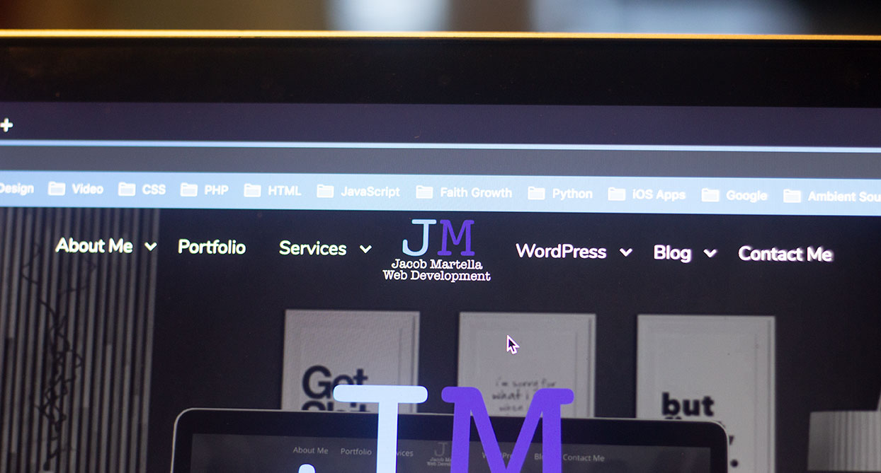
Last time in this series we looked at the site header, what it was and why it’s important. And today we’ll look at the website footer.
So what is the site footer anyways?
Well, the simple answer to that is it’s the bottom element to any webpage. It’s the last thing people will see if they scroll down to the bottom.
Like the header, information here usually remains the same across every page. And it can be used to help users navigate your website or direct them to other parts of your business, like your social media networks.
While most people probably won’t scroll this far, it’s still a pretty significant part of any website.
Why is the footer important?
So if the footer is at the bottom of the page, and most people probably aren’t going to scroll that far down the page, then why is the footer so stinking important?
Well, footers are the last chance for you to display your branding. You can leave a lasting impression on visitors with a good footer.
Also, headers are typically limited to a certain size because visitors want to get to your content as quickly as possible. But you don’t have that limitation with footers. You can put another menu down here, contact information and links to social media accounts. And it will all be the same for every page.
And finally, footers typically contain your copyright text. It’s a small thing, but it’s kind of important and pretty much the stand. (I mean not that it does much, but still, it looks better to have it there.)
What should be in your footer?
What you put in your footer is completely up to you. There’s no real standard or requirements for this area.
As for me, I at least make sure to have one more menu (typically just a top-level only menu), links to social media accounts, an email link and the “all important” copyright statement.
In addition, I’m a fan of putting my logo in there one last time and my tagline. It’s just one more opportunity for me to make sure the visitor knows who I am and what I do.
But you do you. Put whatever you feel fits the best in your footer.
Examples
So now that we know what a footer is, why it’s important and what goes into the footer, let’s look at a few examples.
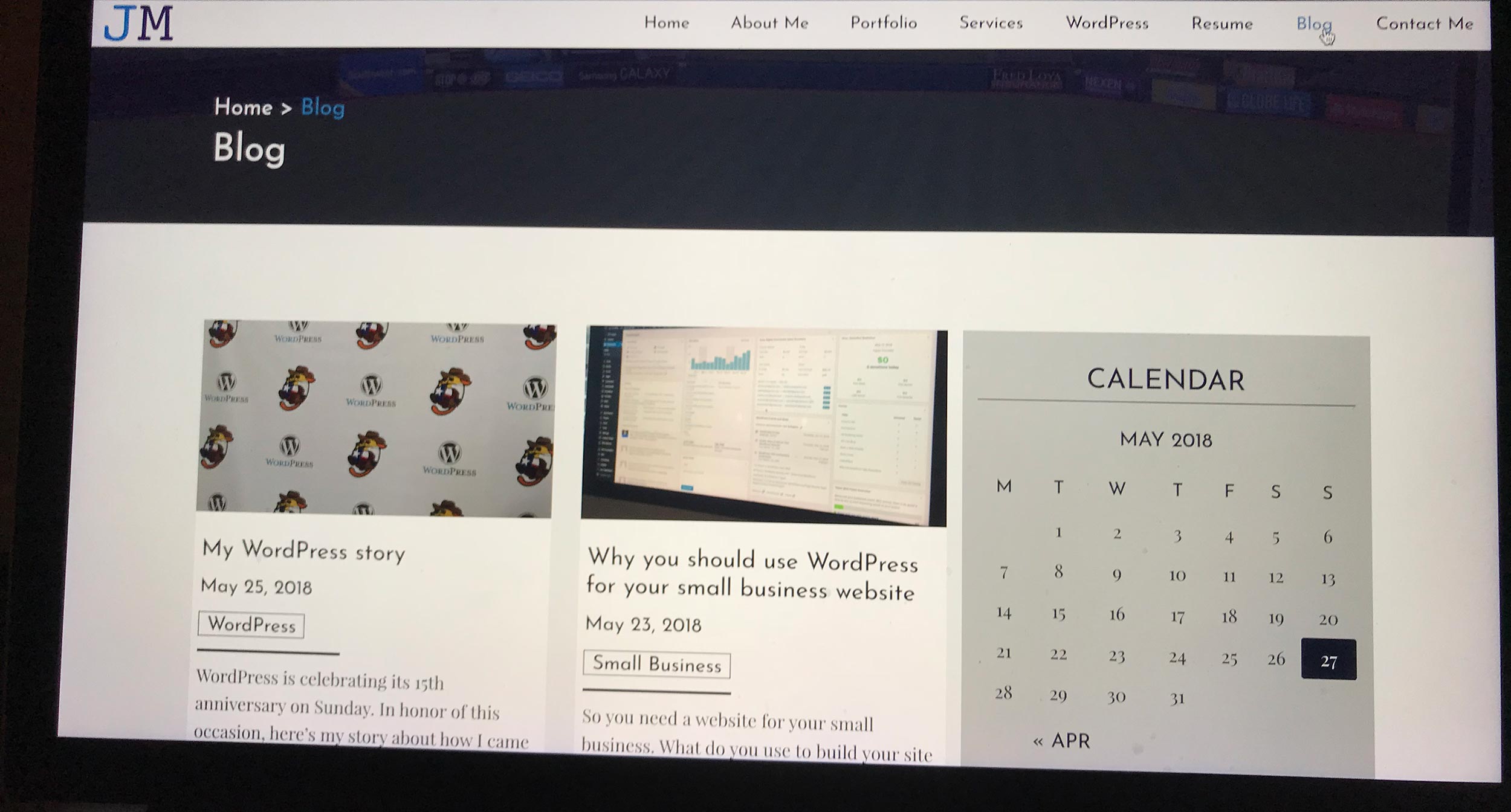
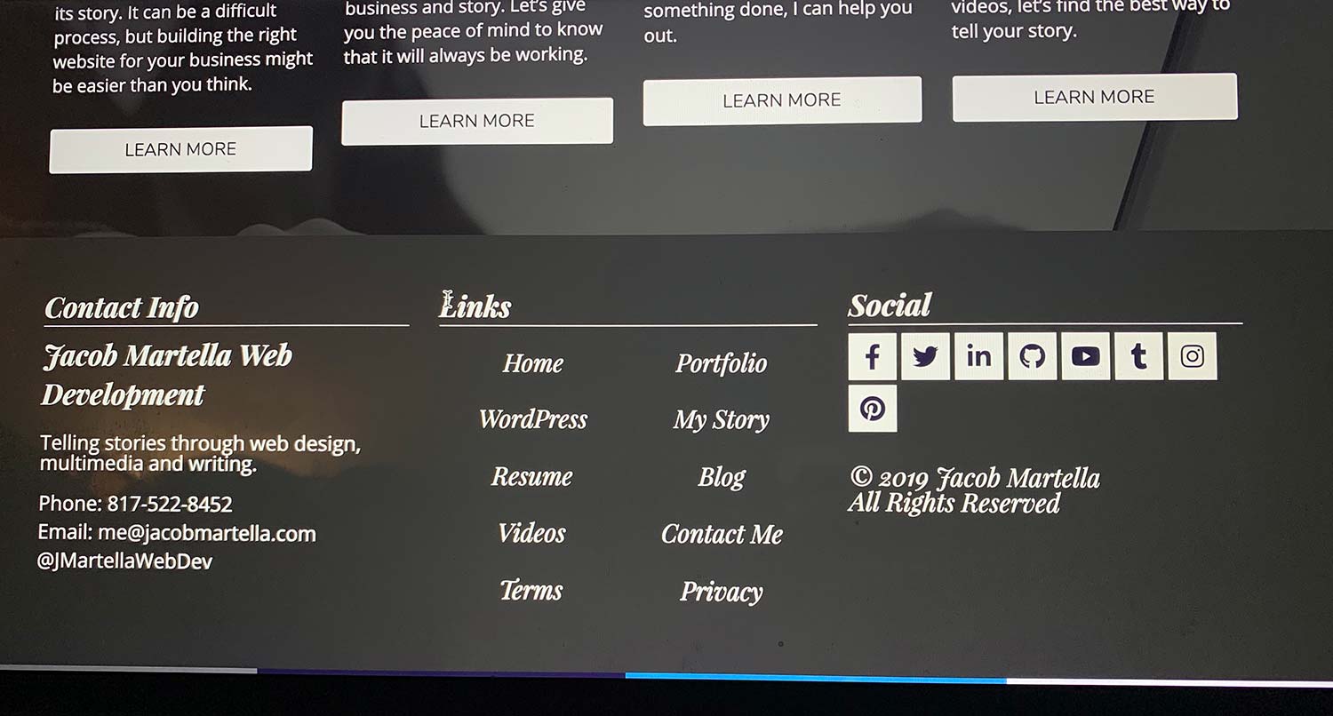
This website
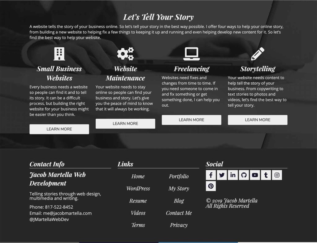
So in this website, I kind of have two footers. The first one you see is what I’m calling a “Call to Action” footer. It basically has four CTAs for each of the services I provide to help visitors navigate to places where I can help them.
Then I have more of a traditional footer with three columns. The first has my logo, tagline and some contact info. The middle one has another menu and the third has social media links and the copyright.
Overall, I’m a fan of the three-column footer layout just in general. It’s the best way to get all of the information I need into the footer but not make it too big.
The Ministry of Type

If you know me, you know that I’m a fan of minimalist designs. I like to make the visitor feel at home with simple designs and a lot of use of white space.
This footer is simple and maybe a bit too basic for my taste, but it’s a great starting point. It could be adjusted (really the entire page needs to go across the entire scree), but overall it’s not a bad start. If you don’t need to put a lot into your footer, you might consider using this as a guide.
Mom & Popcorn
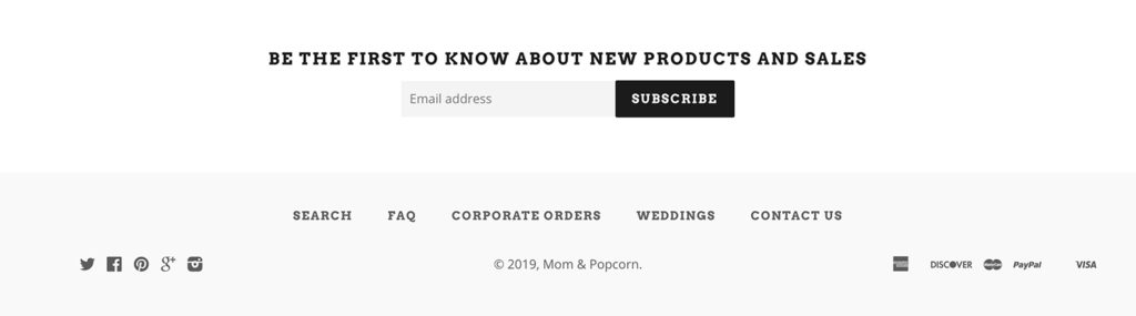
Again, following the minimalist trend, this website does a great job of getting the necessary information and some cool functionality into the footer.
In addition to a clean design and presentation, I love the email subscription sign up. That’s something that you might overlook, and it’s obviously a great way to get leads. Don’t shove email sign ups (i.e. no popups please!), but putting it at the top of the footer is a very good call.
My only nitpick from an accessibility angle is that the hover state for the menu and social media items doesn’t have enough color contrast to either the normal state or the background color. Accessibility should always be at the top of your mind.
Site Inspire

Finally, we come to Site Inspire, which sort of marries the minimalist idea and the three-column footer (like a web designer after my own heart). And it pulls it off almost flawlessly.
It is kind of basic for my taste, particularly the colors (the red would look great for the social media icons), but the contrast is great and I think it can be a great starting point for anyone looking for inspiration for their footer.
So I hope this has helped you with inspiration for your footer and learn more about what it is and why it’s important. It’s the second-most important element behind the header and it’s another great opportunity to leave your branding with prospective customers.