So far in this series we’ve looked at the website header and footer. And today we’ll look at the most obvious thing on any website: the homepage.
So what is a homepage for a website anyway?
Well, most people will find their way to this page if it’s not the first page they see. It’s a chance for you to show off who you and your business is prospective customers.
And first impressions matter, especially in the internet age. You’ve got to get this page right to get people interested in your business.
So let’s dig deeper into the homepage.
What does the homepage consist of?
So what exactly does the homepage consist of?
Well, there are many different ways to approach this, and there’s no one right answer. The only thing that matters is what works for you and your business.
Typically, you will have your logo and tagline some where “above the fold” (a newspaper term for content in the top half of the page). You’re probably going to have at least a photo of you or your storefront.
You might also show off some of your portfolio, talk a bit more what services you provide and made display some of your recent blog posts. And don’t forget the all important call to action button (preferably above the fold)!
But the reality is that you can put whatever you want on the homepage. So play around with it and see what works for you.
Why is the content here so important?
This should be pretty self-explanatory, but it is worth going over again just so we’re all on the same page (no pun intended … maybe).
Anyway, most people are going to end up on your homepage in one way or another. And a lot of people are going to land on your homepage as the first thing they see on your site. That means it’s their first impression of you. No pressure or anything.
But you can really take advantage of it. This is a great opportunity to tell the story of your business. You can show off what you do, what you do for others, what you know and so much more. Let people know what you’re about.
Really lean into making your homepage a place where you show off what you’ve done and what you could do for prospective customers. First impressions matter.
Types of homepages
The homepage is yours to make your own. There aren’t really any hard rules you need to follow other than a) make a good impression on visitors and b) make sure it’s unique to your website so people know that they are on your site.
But in my experience in web design, I’ve found a couple of trends with homepages.
The first is to make it block-like, meaning that each element is stacked on top of each other, rather than elements being side-by-side. This is what I do on my homepage. This makes it a little bit easier for people to read and digest all of the information on your front page.
The sort of opposite of it is more of a magazine website look. This is putting elements, like stories right next to each other. This is a great route if you’re looking to show off all of your content, like if you are someone who specializes in writing or something similar.
Each case is different for each business, so I’m not going to tell you one is inherently better than the other. But see what might be right for your business.
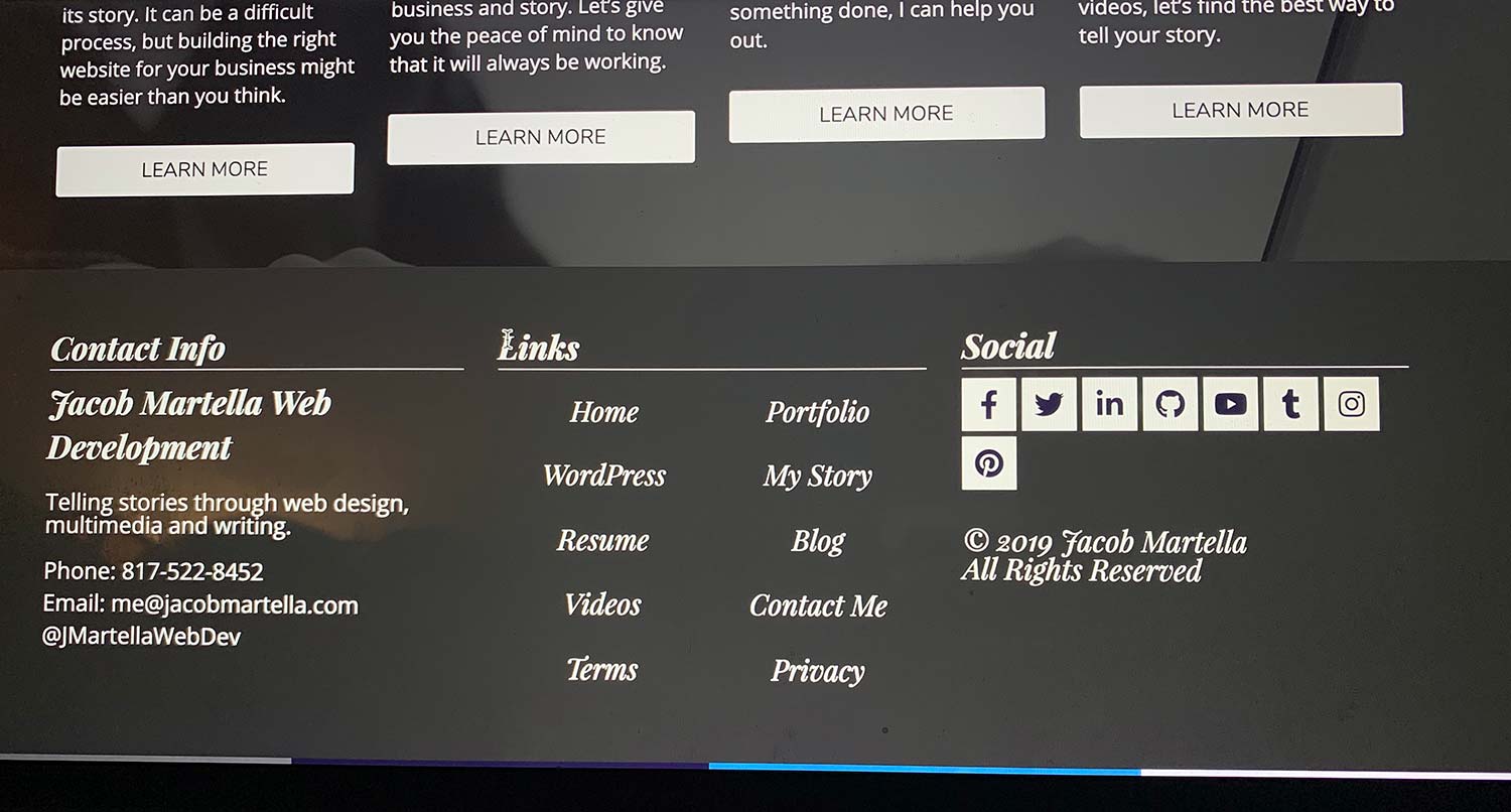
Tell the Story of Your Small Business With a Website
Every small business has a story. And every small business needs a website to help tell it. A website allows people to find you online, serves as a home base for any marketing effort and can help you tell the story of your business. So if you’re ready to give your business its first website or are ready to take your site to the next level, let’s get started on making that happen.
Let’s Get Started on Telling Your Story With a WebsiteExamples
So now that we’ve talked about what the homepage does and the types of homepages, let’s look at a few examples.
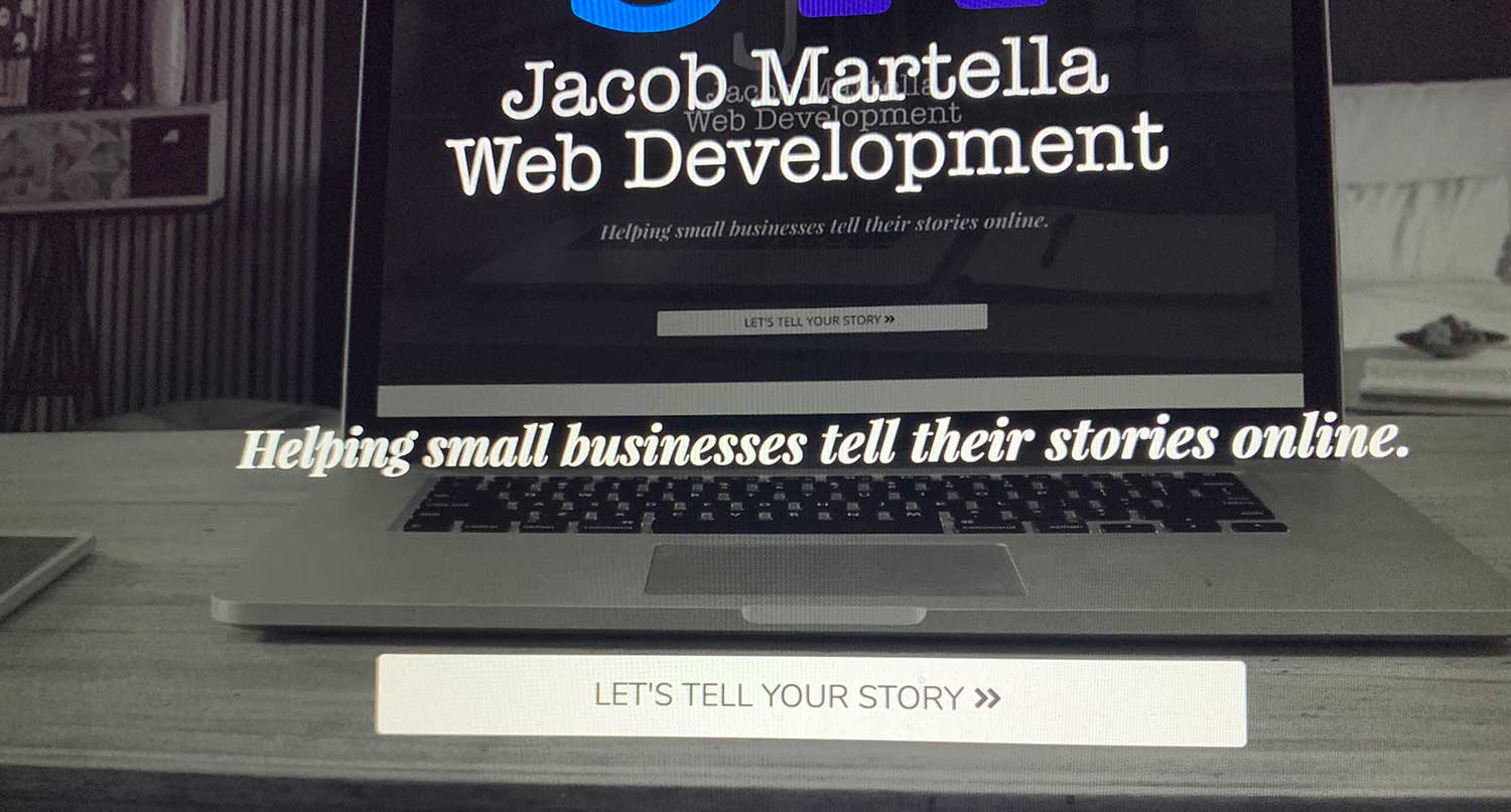
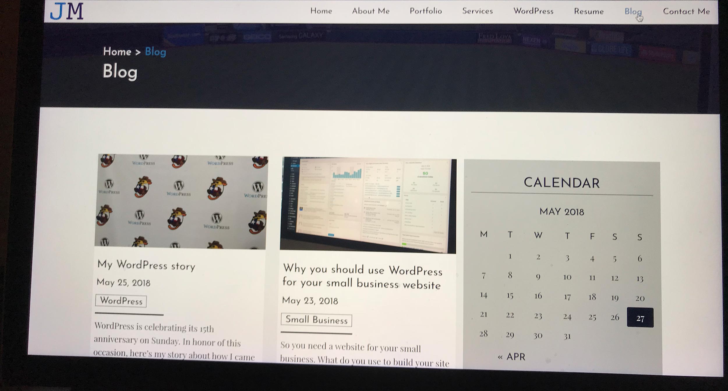
This Website
Like always, let’s take a look at my own website. As I’ve said before, I prefer a minimalist style and it shows a bit on the homepage. Everything is more or less in block sections, and I try to keep as much white space (or grey space) as possible.
Also, I like a good hero image at the top and make sure there’s a call to action to the services page above the fold. And then I’m featuring the service
For a small freelance operation, I don’t think it’s that bad.
StudioPress
If you thought I had a ton of white space, wait until you see StudioPress’ homepage. It takes it to a whole new level. I don’t think it’s to the point of being bad, but it is a little bit too much for me, particularly the vertical white space.
That being said, it does a good job of explaining what it is and how it can help you. Also, the multiple calls to action help direct you to pages that can help you the most. Overall, it’s not too bad of an example to use for your website.
The Athletic
I was a journalism major at the University of Texas with a sports emphasis (and subsequently covered a couple of Texas Longhorn sports teams), so I’m a fan of The Athletic. And I’m a fan of their website (except for the hundreds of accessibility errors). Their homepage is no different.
It’s simple, clean and easy to read. It does a great job of describing everything about The Athletic but without completely cluttering the page. And it has calls to action on the top and bottom of the page.
And when you log in, I’m a fan of the personalized homepage that’s clean and easy to read. So easy to find the headlines and stories I want to read.
Abel & Cole
Finally, we end with an actual business, ecommerce website. Able & Cole features a very pleasing website to look like. Out of the four examples, it packs in the most information, but manages to just keep it from being too much. Again, the sections really help to manage the cognitive overload.
If there’s one nitpick I have, it’s that the images with borders look a little too cute. But it also seems to find their branding and how they want customers to remember them, so it’s not too bad, although the quality of images could really be better.
Also, the repeated same call to action in each section is a bit annoying. Multiple calls to action are fine so long as they aren’t all the same exact link.
So there you have it. That’s what the homepage is all about for your ecommerce website. It’ll take some trial and error and testing to get it just right, but when you do, it’ll really help your business online.