Ah yes, the store page. This is where the action really starts to happen.
Sometimes the store page is the homepage. Sometimes it’s not.
But more often than not, this is the page where prospective customers begin to turn into paying customers. They see what you offer and if they like what they see. And then they begin to set foot into your funnel to turn them into converted customers.
So it’s extremely important that you get this page right. Create a page that both looks really enticing and works like it should and you’re headed down the right path. But if not, it’s going to be a bit of an uphill climb.
So let’s talk about the store page.
What needs to be on it
Obviously, your top or latest products need to be on this page. That’s the whole point of the webpage after all. Plus, you probably should have links to the customer’s account (or to sign up/login) and their cart, if you don’t already have those in your menu or header.
But how you show off those products is up to you. Depending on your business, the products might each take up a section with a photo, title, brief description, price and call to action button. Or they could just be in nice rows and columns and be filterable.
This is where you show off your products. This is where you start to convert people from prospective customers to paying customers. So making sure the presentation of the page and products is top knotch is your top priority.
But there’s also this key thing called functionality, which leads us to…
Functionality vs. Design
While the store page might seem simple, really there is an underlying struggle that can take place on this page. It’s the everlasting battle between the design of the page and the functionality of the elements on the page.
For example, you can have the most engaging, eye-pleasing store page on the web. You can get great reviews about how it looks. But if the design is causing the page the be unusable because people can see elements that they need to see or for important elements to be covered up, then it’s simply no good.
And likewise, a functional store with no design doesn’t lead to conversions. So you need to find the line between an engaging design and having all of the functionality that you need on the page.
Where is that line? It simply depends for each website. You’re going to have to do some testing to see where the line between cool design and the necessary functionality is. Like I said, this is something that will always be ongoing, so test, fail and change.
I also want to note that this happens on more than just this page; it’s just that it becomes a lot more prevalent here since the functionality is so important.
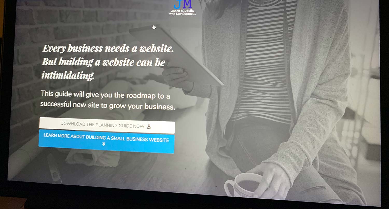
Tell the Story of Your Small Business With a Website
Every small business has a story. And every small business needs a website to help tell it. A website allows people to find you online, serves as a home base for any marketing effort and can help you tell the story of your business. So if you’re ready to give your business its first website or are ready to take your site to the next level, let’s get started on making that happen.
Let’s Get Started on Telling Your Story With a WebsiteExamples
So now that we’ve talked a bit about store pages, let’s take a look at a couple examples in action.
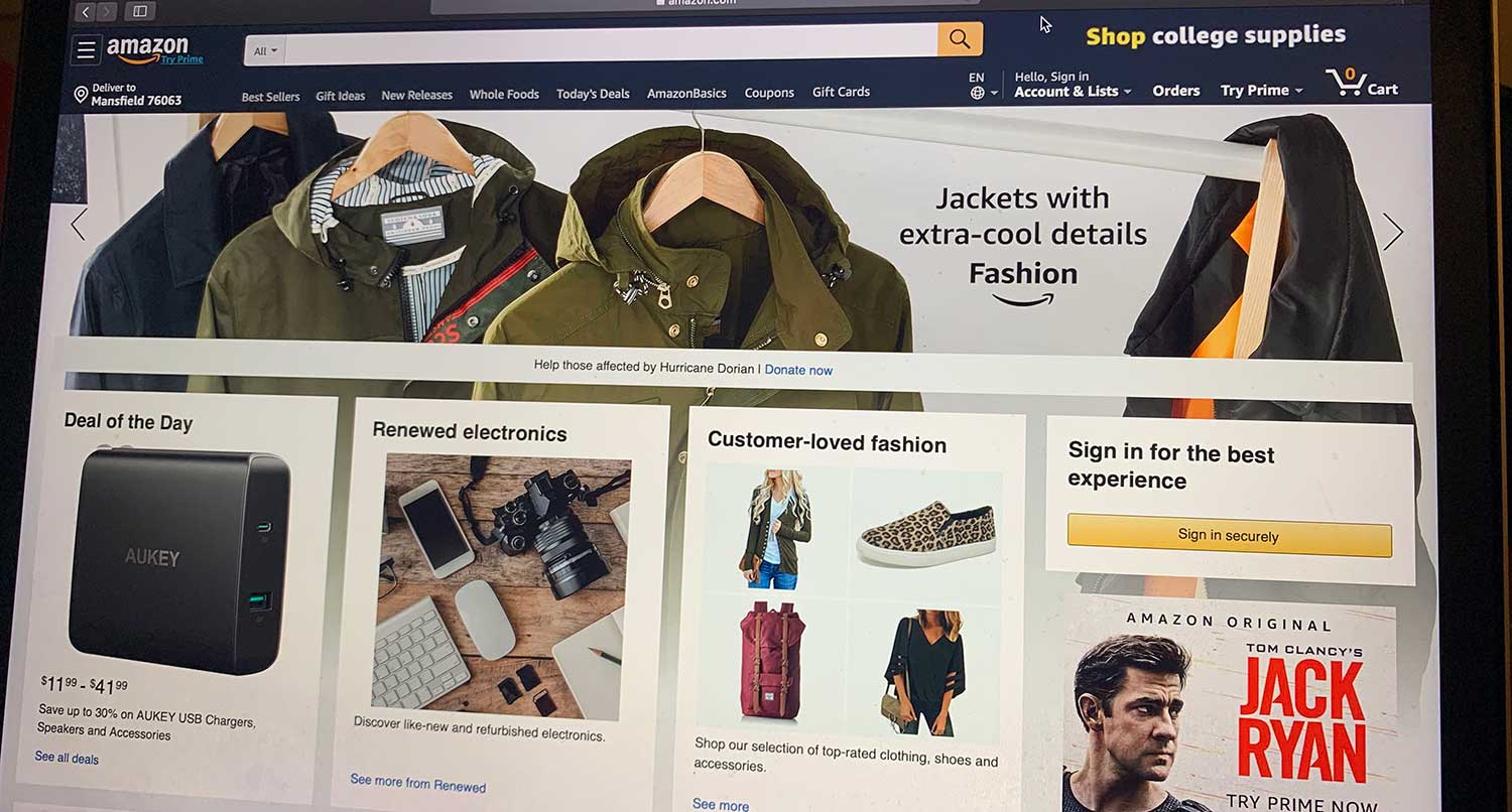
Amazon
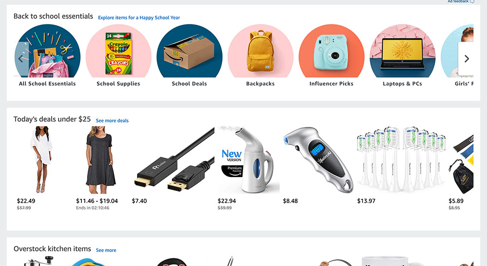
Amazon is probably the best known online seller, so it doesn’t hurt to look at the best. Their homepage is their store page, and man are there a lot of products on this page. Row after row of products, to the point that it really just gets cluttered. I know most people use the search bar by default, but this homepage kind of just makes me confused.
The good news is that you probably don’t have this volume of products, but this is a good reminder to space some things out. Don’t overload your customers and make them have to think too much to buy your product.
Etsy
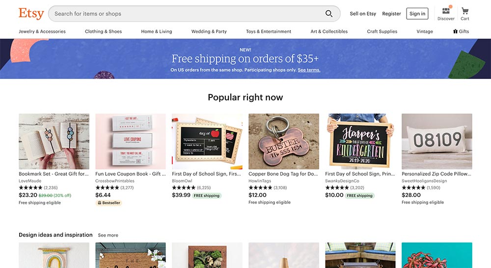
Etsy’s homepage is also their store, and they do a lot better job than Amazon of spacing out their content. There are a lot of products here, but the use of white space creates necessary separation between all of them. It’s more relaxed and I can feel like I can take my time looking at this page.
And that relax-ness can go a long way for your customers. Obviously, you want them to become paying customers. But don’t rush them with a design that makes them feel like they have to purchase a product or overload them with a ton of products on top of each other.
So if you’re currently building or about to build a website for your business, spend a lot of time thinking about the store page and how you can make things stand out and turn prospective customers into paying ones. And if you currently have a website, see what small tweaks you might be able to make to convert more people.
This is where the action really starts to happen.