A website is never completed.
That’s one of the few universal truths with websites. You’re going to be constantly making changes and updates to your website.
I redo my website almost once a year as I learn what works and doesn’t work with web design and as I learn more about the best practices. And I am always making constant small updates to fix page speed, accessibility, etc.
And you will too, or you already do if you’re on top of your game. You’re going to be updating content, changing colors to fix contrast problems, adding in plugins or extensions to fix a few things and more.
It’s important to do that so your website is as good as it can be. Your website will never be perfect, but in that pursuit of perfection you’ll end up with a darn good website.
So let’s go through some simple fixes and changes you can make today or this upcoming weekend to improve your website and your users’ experience on your website.
Table of contents
- Fix your page speed
- Use correctly sized images
- Better organize your menu
- Use correct subheadings
- Make sure you’re not using weird colors
- Use paragraphs in your content
- Add in a related posts section
- Check for old links
- Make sure you have a compelling about page
- Use Google Analytics to figure out what to change
- WordPress Website Care can help you
- Create a new website with a great foundation
Fix your page speed
The best thing you can do right now for your website to help out your users and your search engine optimization is to make sure it’s loading as quickly as it can be.
Google will soon be rolling out an update with how it ranks websites for its search results, and it’s going to be taking Core Web Vitals into more account.
So what can you do to fix your page speed?
Well, first things first. Run your website through Google PageSpeed Insights and see what score you get. Then see what things it recommends to fix to increase your page’s speed. You might need a developer for some of those things.
One thing you can do on your own, and something that will likely get picked up by PageSpeed Insights, is images that are too big and take too long to load. I talk more about that in the next section.
Also, make sure you’re not making big calls to outside resources. This goes for embedding tweets on your webpage (I recently had a post go from about 60 on the PageSpeed scale to the 20s because of one tweet) and external ad networks.
Finally, you might want to see if your web hosting might be holding your website back. If you’re paying for very cheap hosting, you’re probably going to need to move to a more premium hosting provider to get that speed boost. And yes, it will be more expensive, but it will be worth it in the long run.
If you want to take a deeper dive, I would recommend checking out a blog post I wrote on speeding up your website and two videos I did on the topic, both in general and for WordPress.
How to Speed Up Your Website
Use correctly sized images
As I just mentioned, one of the biggest things you can do right now for your page speed is to make sure your images are correctly sized.
Simply put, you don’t need to have images that are over one megabyte in size. Those images are going to take forever to load for your users, especially if they don’t have a great connection. And if your website takes more than three seconds to load, the general rule of thumb is that about a quarter of your visitors are going to leave. Don’t let your images push people away from your website.
So, you’re going to need to reduce the size of your photos. I wrote a blog post that went into this in more detail, so I highly recommend you check that out.
But here’s the short version of what you need to do. First, open the photo with your preferred application. Then shrink the image width to no more than 2000 pixels wide unless you absolutely need it to be that wide. Then make sure the resolution is under 100.
Finally, when you go to export or save the photo, move the image quality or compression to between 50 and 70 percent. Alternatively, you can use another app, like ImageOptim, to compress the photo even more.
And if you have any technical knowledge and don’t use WordPress, you can use lazy loading to make the page loading experience much better for your users.
But make sure that your images are only as big as you need them to be.
Better organize your menu
Also in the realm of user experience, make sure that your main navigation is thought out and organized correctly.
This will help with two things.
First off, because your navigation is on every page, search engine crawlers are going to notice those links appearing a lot of the time and it’s going to be a signal to them that those pages are important on your website. So those pages might see a bit of a rankings boost because of that. So you want your top pages, like your service landing pages, to be in the top navigation.
The second thing is the user experience. A well thought out main menu will make it really easy for a user to navigate through your website. And that might help them keep coming back to your website.
But a bad menu that has a lot of top-level items or is not ordered correctly is going to be really hard for someone to use. And that can be extremely frustrating and just a turn off. And who knows if that user is ever coming back.
So take some time to think about your main navigation. Figure out what pages need to be on the top level and visible at the start. Keep that to no more than eight items. Then figure out what other pages need to be in the menu and organize them to be underneath the top level item that makes sense.
If you already have a lot of pages and content, it might take you a while to come up with a new plan for your menu. But it will be so worth it in the end.
Get Web Hosting That Helps Your Business
Do you have a WordPress website and want to get these improvements done for you? Then sign up for one of the WordPress Website Care plans today! You’ll get at least five hours a month of changes and adjustments included in the plan. Plus, you’ll get top-of-the-line hosting, managed WordPress core, plugin and theme updates, security and accessibility checks and more. It’s the perfect plan for your website!
Let’s Give Your Website the Care it DeservesUse correct subheadings
Moving on to the accessibility front, you really should go through all of your content — especially your posts and pages — and make sure that you’re using the correct heading structure.
This actually helps on two fronts: accessibility and SEO. With accessibility, screen readers use all of your headings to create an outline for the user to navigate through your page. Plus, search engines use the headings to help index your website. So using them incorrectly can make it harder for people and computers to move through your content. Not good.
So make sure that each page has just one H1 or level one heading. If you use a content management system, this should be the page or post title, and the theme should handle that. (If it doesn’t, you should start to look for a new theme.
Then go through and make sure that each heading that has a main point for your content is a level two heading. Then any headings that fit under those points should be a level three heading. And so on and so forth.
Now both screen readers and search engines have a really good idea for what your content is all about. And if you want to help your readers even further, you might want to check out a table of contents plugin to help people navigate through your content.
Website Accessibility: Headings
Make sure you’re not using weird colors
Also on the accessibility front, please make sure that the colors that you use for your text and your background have the correct color contrast.
While whether or not two colors work for a logo or design might be a subjective discussion, when it comes to color contrast, it’s all pretty objective.
There is a whole lot of complex math that goes into figuring out what the ratio is between the two colors. But here’s a simple breakdown of what you need to know. The Web Content Accessibility Guidelines (WCAG) 2.0 guidelines state that the contrast for level AA, or middle level, is 4.5:1 for normal text and 3:1 for large text (font size 18.66px and bold or 24px and normal font weight). Level AAA, or the highest standard, is 7:1 for normal text and 4.5:1 for large text.
How do you figure out what the ratio is? The good news is that WebAIM has an online contrast checker that you can use to get the ratio. You’ll need to get those hexadecimal values by using the inspector tools for your browser and selecting the text color and background for the elements you’re testing.
Depending on your website (or theme) and your knowledge of CSS and coding, you might need to bring in a developer to help you out with this. But taking some time now to figure this out can make a world of difference to some of your users.
Use paragraphs in your content
Okay, let’s be honest. This should be pretty self explanatory and if you’re a devoted writer you can probably just go ahead and skip it.
But when you are creating content, especially writing blog posts, please make sure that you’re using paragraphs. And this doesn’t just go for blogging. It also goes for social media (looking at you Facebook and Reddit).
I don’t know how many times I’ve seen this on Facebook and then just had to scroll on by because, well, it’s unreadable. And I have occasionally seen it with blog posts in the past as well. I’ve had to stop reading them because they’re hard to understand.
And the thing is that we were all taught about paragraphs in grade school (or at least here in Texas). Plus the good news is that paragraphs don’t have to be just three to five sentences long.
They can be one sentence long, or even one word long.
See.
So if you are guilty of this, go back through your blog posts and add in paragraphs. And then make sure you keep doing that from now on. Everyone thanks you for that.
Add in a related posts section
Next up, something you can easily add to your website if you’re using a content management system is to have a related posts section at the end of your blog posts.
If you’re focusing your efforts on content marketing, one of your goals is going to be getting people to read as much of your content as possible before they become a customer or client. So you need to make sure that your blog posts have links to other blog posts to keep them moving.
And having a related posts section makes this super easy for you, especially if you use something like WordPress. That will automatically select a number of blog posts that are related to the current blog post and display those links to those posts. And once you’ve got it set up, there’s not a whole lot that you need to do.
With WordPress, there are plugins out there that can help you accomplish this. Yet Another Related Posts Plugin is one of the best. If you use Yoast SEO Premium, it also includes a block that you can add to your posts. And if you know code or have a developer, you can add it in via code (so you don’t have to remember to add it every time).
But make sure you have a related posts section at the end of your blog posts to keep people reading your content.
Build Your Website with a Great Foundation
Are you looking to create a new (or first) website for your business that already has these improvements built in? Great! We can work together to get your business online with a professional-looking website that’s built with a great foundation for you to grow from. And the best part is that it won’t break your budget.
Let’s Create a Great Website That Fits Your BudgetCheck for old links
Another thing you need to do is to check for old, broken or bad links. Broken links are, well, not ideal. They can lead your visitors astray, whether it’s a broken internal link or an external link that doesn’t exist. And it can hurt your SEO.
So you’re going to need to periodically check your links on your website. And then if you find any new broken links, you either can just remove them or change the link to a page that actually exists.
Admittedly, this can be a challenge. Manually doing this would take forever and probably be a bit of a waste of time on posts and pages that aren’t super important.
But if you use a content management system, like WordPress, you can add in an extension or plugin that does the checking for you.
I know in the WordPress world there is the Broken Link Checker which will alert you to broken links on your website through the dashboard or email. And then you can update those URLs from the dashboard instead of having to go through to the post.
But make sure you at least check for broken links on your most important pages and blog posts.
Make sure you have a compelling about page
A more advanced thing you can do to improve your website is to write a compelling about page.
I know. I know. Writing about yourself or your business is not easy. I can write a 2,000 word blog post, like this one, with no problems. But ask me to write about myself and my story and it’s going to take me a lot longer to complete that task.
But it can be worth it. A really good about page can convince someone to buy from you. You can take someone who might be sceptical about working with you or purchasing from you and turn them into a client or customer by telling your story in a compelling way.
This can be through a really good text-based story (yes, writing is still an artform and can still move people). Or if you do something visual, you can tell your story through photos or videos (make sure that you use alternative text and captions to keep it accessible).
This is something that’s probably going to take some time, so you might want to only do this once you’ve done the other improvements in this list. And that’s okay. Things that are big and important are going to take some time to create.
So when you’re ready, take some time to make sure your about page is compelling and convincing to help convert your users.
Use Google Analytics to figure out what to change
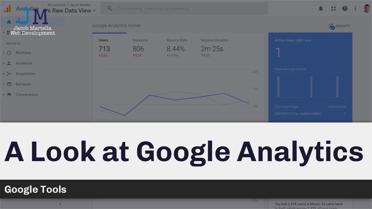
Finally, once you’ve got all of this in place, make sure that you’re using Google Analytics to guide your changes, if you’re not already using it.
When it comes to websites, you really need to be making data-driven decisions. You need to see that something isn’t working right through your data and then make decisions off of that data to improve your website.
And Google Analytics is great at helping you do this. You can see visitors, pageviews, time on page, bounce rate, exit rate and so much more. Plus, it’s completely free.
Getting started with it is super simple, especially if you have a WordPress website and use the Google Site Kit plugin. And I’ve discussed how to get started with it before, so be sure to check out that blog post.
But more important is checking the data. So if you see a page has a high exit rate or bounce rate, you might want to go to that page and see what might be causing it. Maybe there’s a PHP error that’s causing the page not to load. Or maybe there aren’t any links on that page or the content isn’t good. You can then go in and make changes to improve that page.
On the flip side, if you see a page has a good time on page stat and people are clicking from that page to another page on your website, you might want to see what you’re doing on that page and replicate it on your other pages.
But make sure you’re using data to drive your decisions with what to change on your website.
Getting Started with Google Analytics
WordPress Website Care can help you
If you have a WordPress website, you can get most, if not all, of these improvements taken care of for you when you sign up for one of the WordPress Website Care plans. After moving your website over to the plan, I’ll go through the list and see what improvements I can make on your website. Plus, you’ll get exceptional web hosting on WP Engine, managed WordPress core, plugins and themes. It’s the care that your website deserves.
Create a new website with a great foundation
Also, if you’re ready to create a new website for your business, let’s make sure it’s built with all of these things in mind. With the Affordable Website plan, we’ll sit down and map out a website that does all of these things correctly from the start. Plus, you’ll get a professional website at a price that won’t kill your budget. And you’ll get your business online and start your digital marketing efforts.


