What are calls to action?
You’ve probably heard about them, especially if you’re currently looking to redo your website. They seem important from what you’ve heard, but what exactly are they.
Well, you’re right to think that they are important. In this day and age on the internet, you need to capture a visitor’s attention quickly and direct them to where they need to go next on your website. And if everything works out right, they end up being a paying customer, a newsletter subscriber, etc.
So let’s learn more about these calls to action.
What is a CTA?
A call to action (CTA) is kind of just like the name implies. It’s a call for the user to take some sort of action, whether it’s to go to another page, sign up or purchase a product. You’re directing the visitor to do something that might help them out.
Typically, you’ll see CTAs as buttons throughout the page. Typically the text accompanies it is either “Sign Up!” or “Buy Now”, and it stands out from the rest of the page. That being said, there are no major rules to how CTAs should look other than they should be a link or have an action associated with them (signing up for a newsletter) and they should definitely stand out from the rest of the page
But you can play around with the text, size, colors and placement of the CTA to figure out what works the best for your website and visitors.
Why are CTAs important?
So why exactly are CTAs so important and why should you have them on your website? Well to put it simply, CTAs help guide users to take actions or to go next to help them with whatever they need help with.
Imagine coming to a website for help but not knowing where to go or what you needed to click to get to where you needed to be? Frustrating isn’t it? That’s what CTAs are there for. They move website visitors to the page they need to be at.
And you can take advantage of this need. By placing a “Buy Now” or “Read More” CTA on your webpage, you can help funnel the visitor to a place they need to go and hopefully turn them into a paying customer.
Tell the Story of Your Small Business With a Website
Every small business has a story. And every small business needs a website to help tell it. A website allows people to find you online, serves as a home base for any marketing effort and can help you tell the story of your business. So if you’re ready to give your business its first website or are ready to take your site to the next level, let’s get started on making that happen.
Let’s Get Started on Telling Your Story With a WebsiteWhere do they go?
The placement of CTAs can play a big part in whether or not they clicked on. They have to be visible and clearly defined as an action for the user to click and move through.
Ideally, every landing page must have at least one CTA appear above the fold. This means that the CTA button or form needs to be visible on the page when the page loads, and the user should not have to scroll down the page to see it. A sizeable portion of your visitors are not going to scroll through your landing pages, so having that CTA at the top makes it much easier for them to see and click through.
Other CTAs, like a or more general ones like I have on this website, can be placed near the footer or at the bottom of different sections (you can see the Services page for a better example of that). Those can help direct a user after they’ve read through some of your content.
Examples
So now that we’ve discussed CTAs and why they are important, let’s look at a few examples.
This Site
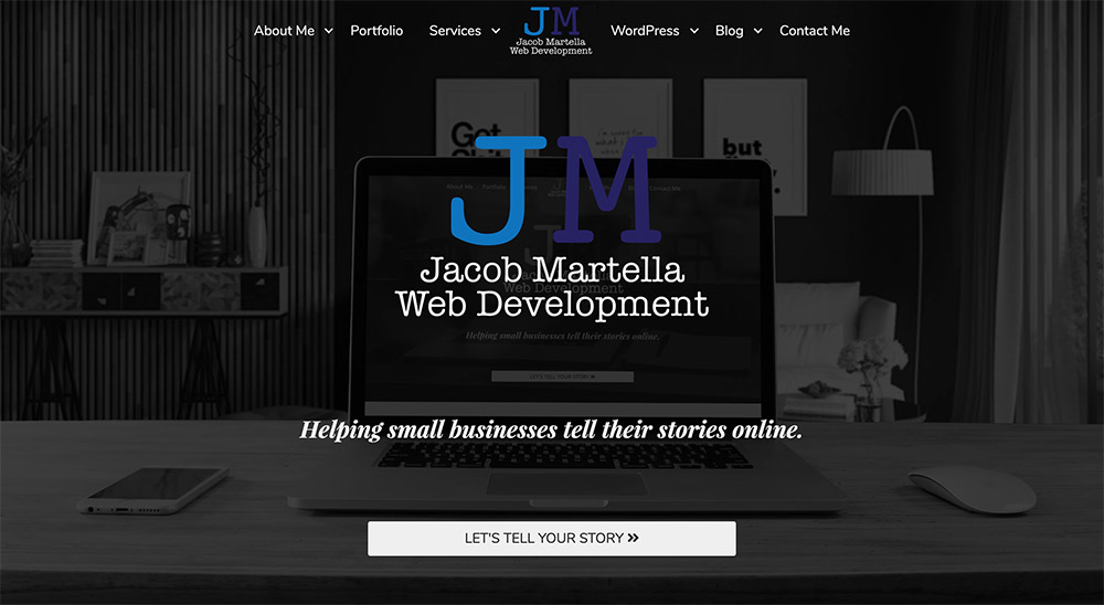
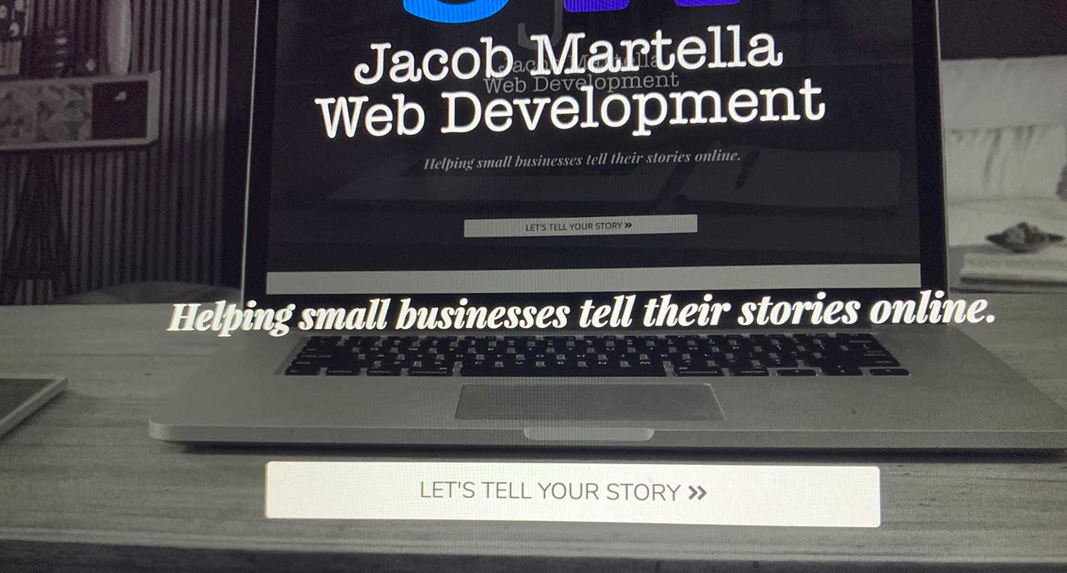
On my website, I have multiple areas for calls to action. In fact, I there are a few on this very page. (Can you find them?)
But for this, we’ll just look at the homepage. I have a main call to action in the hero image section, just above the fold. It invites the visitor go to a page where they can figure out what I might be able to help them out with. In this case, my services page. And then there are more CTAs on that page to direct them on where to go.
Then there are different CTAs throughout the homepage to help visitors go to the portfolio page, blog page, etc. I know last time we talked about the homepage, and if you have a fairly complex website, having multiple CTAs throughout the page to direct visitors to sections they might be interested in is a pretty good way to go.
Trello
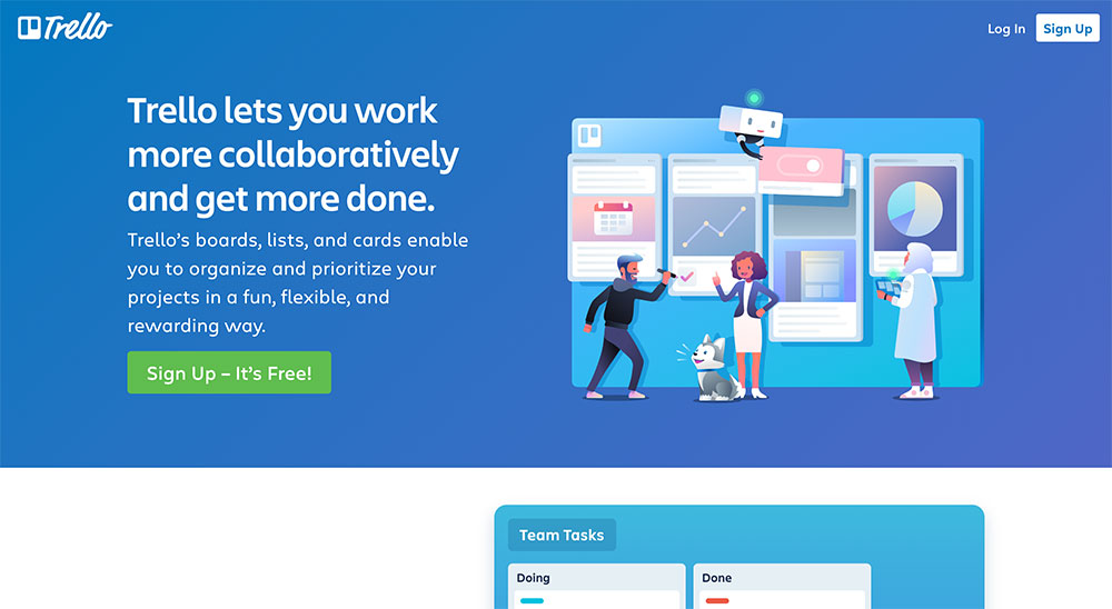
Trello does a really good job of getting right to the point with their hero section and call to action. The blue works perfectly as the background, the image is eye-catching but not too distracting and the text is straight to the point.
As a plus, the text for the CTA button is inviting. “Join Us” and “free” are probably some of the best words a potential customer wants to see or hear, and it invites them to click and learn more. You can’t go wrong trying to emulate what Trello has done here.
Netflix

Finally, Netflix does a really good job of drawing you in and convincing you to click their CTA. The background image features a number of titles that a lot of people are probably interested in. The text is short and very to the point. And again, we see the word “free” in the CAT button. Kind of hard to resist that.
I’d probably still go with a little bit more opacity on the black behind the text so the text is always readable, but it’s still a pretty good example for you to use for your website.
So if you’re even if you’re not redesigning your website, take a peek around your site and see where you might be able to place CTAs. Play around with them and see what happens with your website statistics. A simple change could go a long way in helping your visitors.

