Hey, do you have any accessibility issues on your website?
If you already know the answer to that question and your answer is “not many or none”, then great! Good job and keep up the good work making sure your site is accessible.
But if you don’t know or you know that it is poor, well you’ve got some work to do. It’s okay. It happens to everyone, and it can be a complicated subject that’s hard to wrap your head around. Obviously, not everyone is an accessibility expert.
Still, there’s no time like the present to get to work on fixing your website’s accessibility. So let’s walk through six accessibility fixes you can make right now on your website to help you get started.
Why does accessibility matter?
Did you know that about 54 million Americans have some sort of disability, according to a 2005 study from the U.S. Census Bureau? That is a large portion of your potential customer base for your business.
Now imagine that those same people aren’t able to read your website, navigate through your website or purchase your products. Imagine their disappointment and frustration that they aren’t able to do the thing other people are able to do because they use some sort of assistive technology (or even just their keyboard) to browse the web. And your website isn’t built up to the standards to let them do that.
And, if you even need financial incentive to get onboard the accessibility train, think of all of the potential sales that you might be missing out on because those people can’t work through your website.
Accessibility matters because everyone should be able to use your website no matter what technology they use to browse the internet. That should be the core tenant of any website.
Why Website Accessibility Matters
Adding alternative text to your images
The easiest accessibility fix you can make for your website right now is to make sure all of your images have alternative text accompanying them.
Alternative text is essentially text that goes along with the image (inside of the image HTML element) and is read by screen readers and other assistive technology to the user so that they can understand the image being shown. Also, if your image fails to load for whatever reason, the text will show up in place of the image so everyone knows what should be there in its place.
If you’re using just plain HTML, adding alternative text is as easy as just adding an alt attribute to all of the image elements, like this:
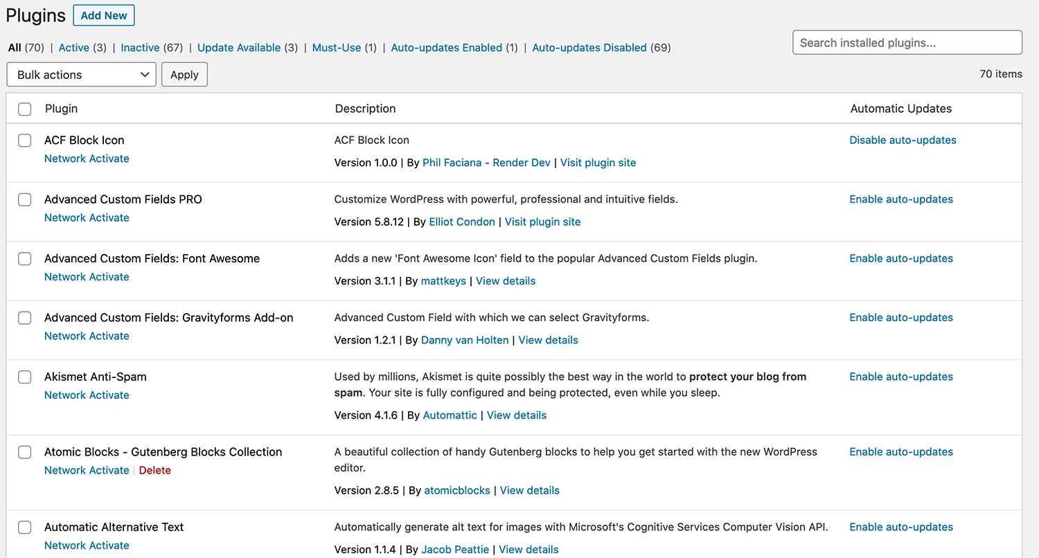
<img src=”{your image source url}” alt=”some alternative text for the image” />And if you use a content management system, like WordPress or Drupal, it gets even easier. When you open up the image (or media) editor in the back end of your website, you should see a spot to enter in alternative text for that image.
So take the time to add in the alternative text for your website today. It’s an easy win for you as you start your accessibility fixes, and it really helps out those who need that text to help them understand and use your website.
Get Web Accessibility Help and Web Hosting
Website accessibility is an ongoing task. You have to not only make sure your website is currently in compliance, but also that it stays that way when you continue to add content and new features. With any of the WordPress Website Care plans, you can get accessibility monitoring (and fixes), plus top-of-the-line web hosting, managed updates, security and much more. It’s the perfect plan to make sure your website stays perfect.
Let’s Give Your Website the Care it DeservesMaking sure your headings are correct
Also, another really quick fix you can make right now is to check your heading structure. Yes, what level headings you are using truly does matter, both for accessibility and SEO (hint, hint).
How does it affect accessibility, you might ask. Well, screen readers and other assistive technology scan the HTML of your webpage to create an outline for their users. And if you’ve ever started to dive into HTML, you’ll know that there are six levels of heading, with H1, heading 1, being the highest and descending from there.
From this the assistive technology can create a navigable outline so that the user can jump through the page effectively. And by the way, search engine crawlers also use these headings to help index and rank your webpage. Two birds; one stone.
So, you need to make sure that there is only one H1 heading on each webpage. For your homepage, this is probably going to be your business name. For posts or pages, it will be the title. From there, each direct sub heading will be an H2 and then the sub headings under that would be H3. And so on and so forth.
And if you’re using a CMS like WordPress, you can do this in a literal snap.
Website Accessibility: Headings
Use form builders with accessibility
I can almost guarantee that you have some sort of form on your website. I mean, everyone at least has a contact form for people to reach out to them.
Forms can be tricky with accessibility these days. If you follow the basic HTML for creating a form, you’re going to be okay with everyone being able to fill them out. But the problem comes when people start to try to make them look cool.
Everyone wants to do that. For a while I did the same. I used a placeholder instead of a label to label my fields. And yeah, that might look cool from a design standpoint, it’s a headache for accessibility.
Labels are what screen readers and other technology use to describe the field to their user. If a field has no label, the user has no idea what field they are filling out. And more often than not, they are just going to bounce away from your website.
To that end, make sure the form builders you are using are accessible. If you are using WordPress, go with plugins like Gravity Forms or Ninja Forms or Contact Form 7 (all of which are great plugins anyway). Test all of your forms with the HTML Code_Sniffer browser plugin and check to see if you are throwing any errors. Then if you are, either fix something with the form or move to a more accessible form builder.
Check your text and background colors
Also, if no one can read the text on your page, well then that text is pretty useless. So it is pretty imperative that you check the color contrast between your text color and background color.
There is a whole lot of complex math that goes into figuring out what the ratio is between the two colors. But here’s a simple breakdown of what you need to know. The Web Content Accessibility Guidelines (WCAG) 2.0 guidelines state that the contrast for level AA, or middle level, is 4.5:1 for normal text and 3:1 for large text (font size 18.66px and bold or 24px and normal font weight). Level AAA, or the highest standard, is 7:1 for normal text and 4.5:1 for large text.
How do you figure out what the ratio is? Like I said, there’s a lot of math that goes into it. But the good news is that WebAIM has an online contrast checker that you can use to get the ratio. You’ll need to get those hexadecimal values by using the inspector tools for your browser and selecting the text color and background for the elements you’re testing.
There’s a good chance that you might need to bring in a developer for this. But it’s crucial that you check these values. If people aren’t able to read your content, you’re doing a major disservice to them, and they will take their money elsewhere. And that leaves you with money left on the table.
Website Accessibility: Color Contrast
The difference between buttons and links with accessibility
Another common mistake I’ve seen on various websites is using buttons and links (specifically anchor tags) incorrectly. Because yes, which HTML tag you use does actually matter.
This one is also something that you might have to reach out to a developer for help for because it will deal with code. But it’s something that is definitely worth fixing.
Essentially, Anchor tags (<a>), otherwise known as links, need to go to another webpage or a different section on the same webpage. Buttons, on the other hand, do other functionality, such as submit a form (though you would use for that, or open up modals.
The problem is that people who are using screen readers and other assistive technology get told whether something is a button or a link. And when the element does something they aren’t expecting, it can get a bit disorienting.
And a lot of developer tutorials are to blame. So many times will I see a tutorial tell someone to use something like <a href="#"> as a click point to make something happen with JavaScript. Meanwhile, using the button element would be a much better option.
Sure, it’s a semantic thing. But making sure your website is semantically correct can give you a pretty good accessibility foundation to start with. And it makes it easier for everyone to get around your site.
Get Insights on How to do a Small Business Website Right!
Are you looking to get some help with your small business’ website, but aren’t quite in a spot to take that next step? No worries! I’ve got you covered with a small business newsletter. This weekly newsletter will talk about a different subject related to websites and small businesses each week, as well as highlight blog posts that can help you out. This will help you optimize your business’ site as much as you can while you get yourself into a position to take the next step for your website.
"*" indicates required fields
Make sure your videos have captions
Finally, one change you can start working on right now is making sure your videos have captions. Not everyone can hear what you are saying, and those people might really benefit from what you are speaking about. Plus, if your public speaking voice isn’t great (raises hand), it can be a great way to make sure that everyone can understand what you’re saying.
Admittedly, this is a very tedious and time consuming task, especially if you already have a lot of videos and long videos at that. I’ve been doing this with my videos since I started up my brand channel in 2019, and it takes me about an hour to transcribe a five minute or so video.
But if it helps even one person understand what I’m talking about, then it’s worth it. And if your message is really important, wouldn’t you want everyone to be able to hear or read what you said. Plus, there is a positive SEO side effect with adding those captions.
The good news is that once you’ve transcribed it in a word document, video upload sites like YouTube and Vimeo make it easy to add those transcriptions . And those stay with the video wherever it gets embedded. Plus, if you have a dedicated page on your website for your video, you can also publish the transcription there as well.
But take the time to make these accessibility fixes. It will really help you make your website accessible for everyone who uses it, no matter what technology they use to access it. And I think you’ll find that it will help your abled users as well.
What are you waiting for? Get started!