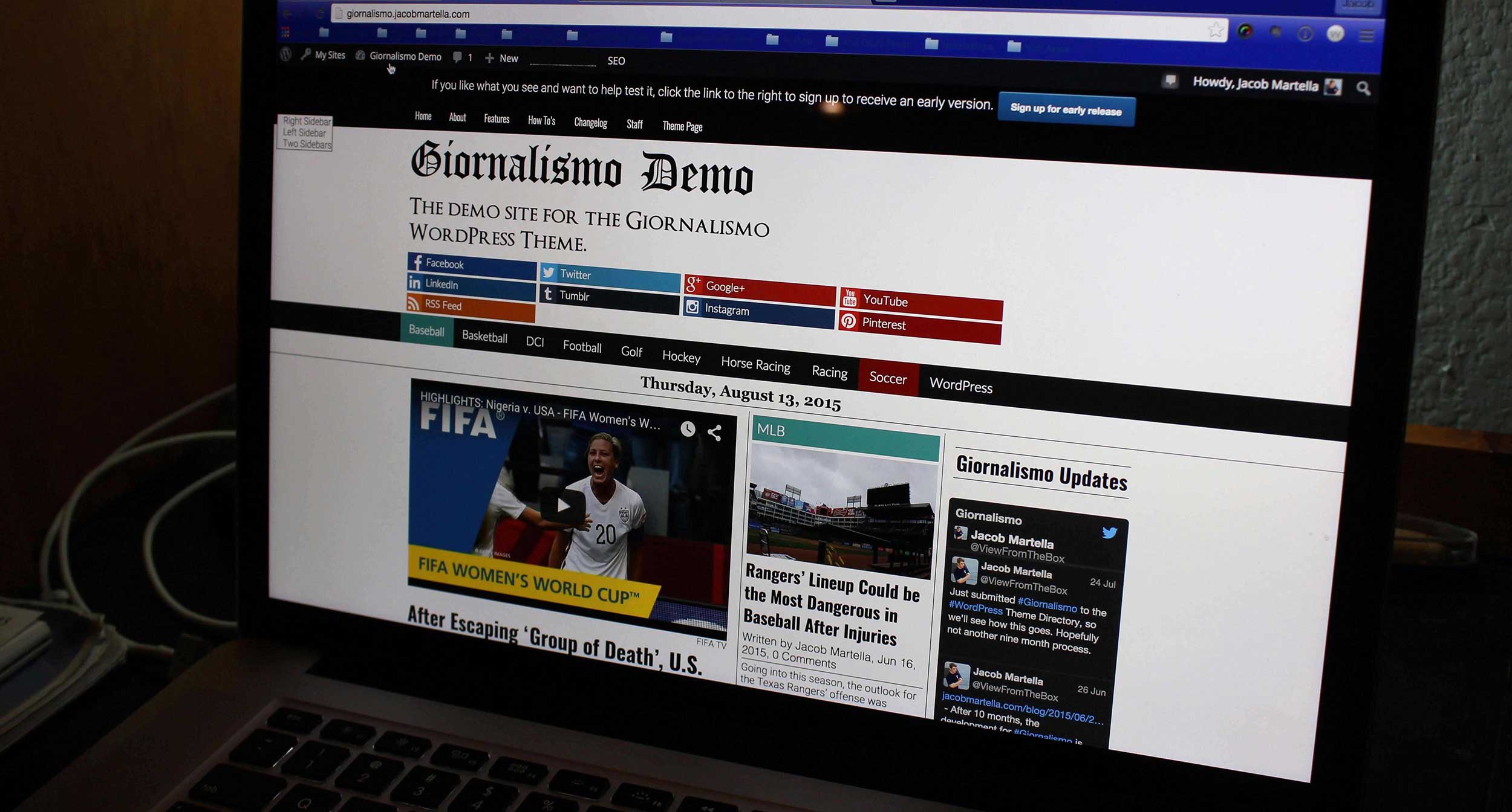
So thing have been chugging right along with work for the Giornalismo theme. The breaking news feature actually didn’t take that long to figure out. After figuring out how to get the current time from WordPress and then subtracting that from the time of the post to figure out how long it’s been published and comparing that to user input, display and styling the breaking news box was surprisingly easy, even for mobile devices.
Now comes the boring and monotonous part: adding mobile styles.
When I initially coded the mobile styles, I only did it for screen sizes 320px wide and smaller. Now that most of the other features have been added, I’m going through and adding the mobile styles to the other screen sizes as 20px intervals.
For the most part, this isn’t exactly a hard task to do, but it is certainly tedious and time consuming and boring. But it’s necessary, so it’s got to get done.
After this, I’ll work on implementing the Twitter cards feature as well as the favicon logo feature.
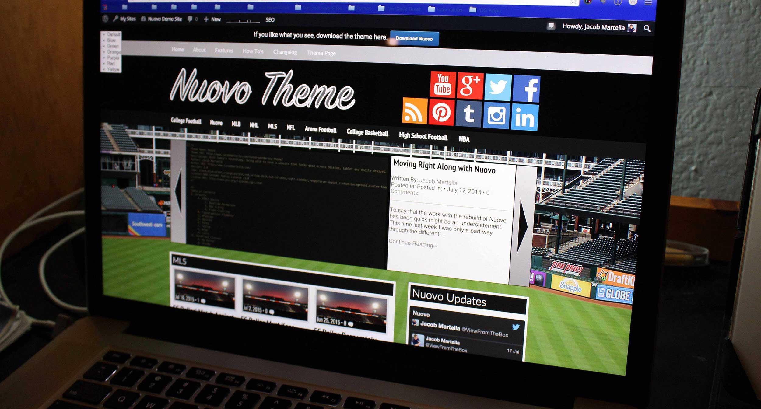
As for Nuovo, there’s still no news, so we’ll see what happens there.


