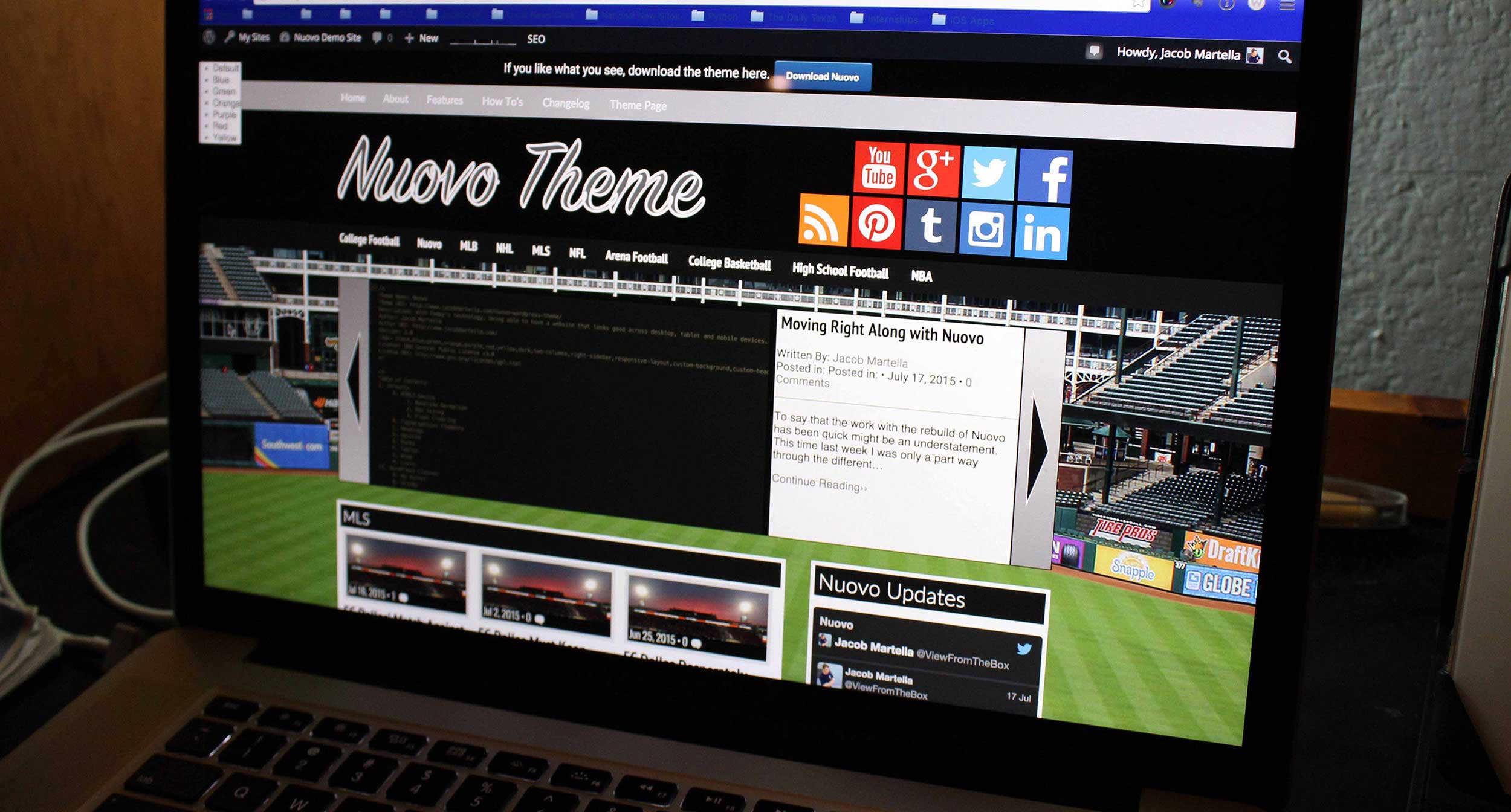
So another week has gone by and there’s still no news for the Nuovo theme either being ready for the WordPress theme directory or needing more fixes.
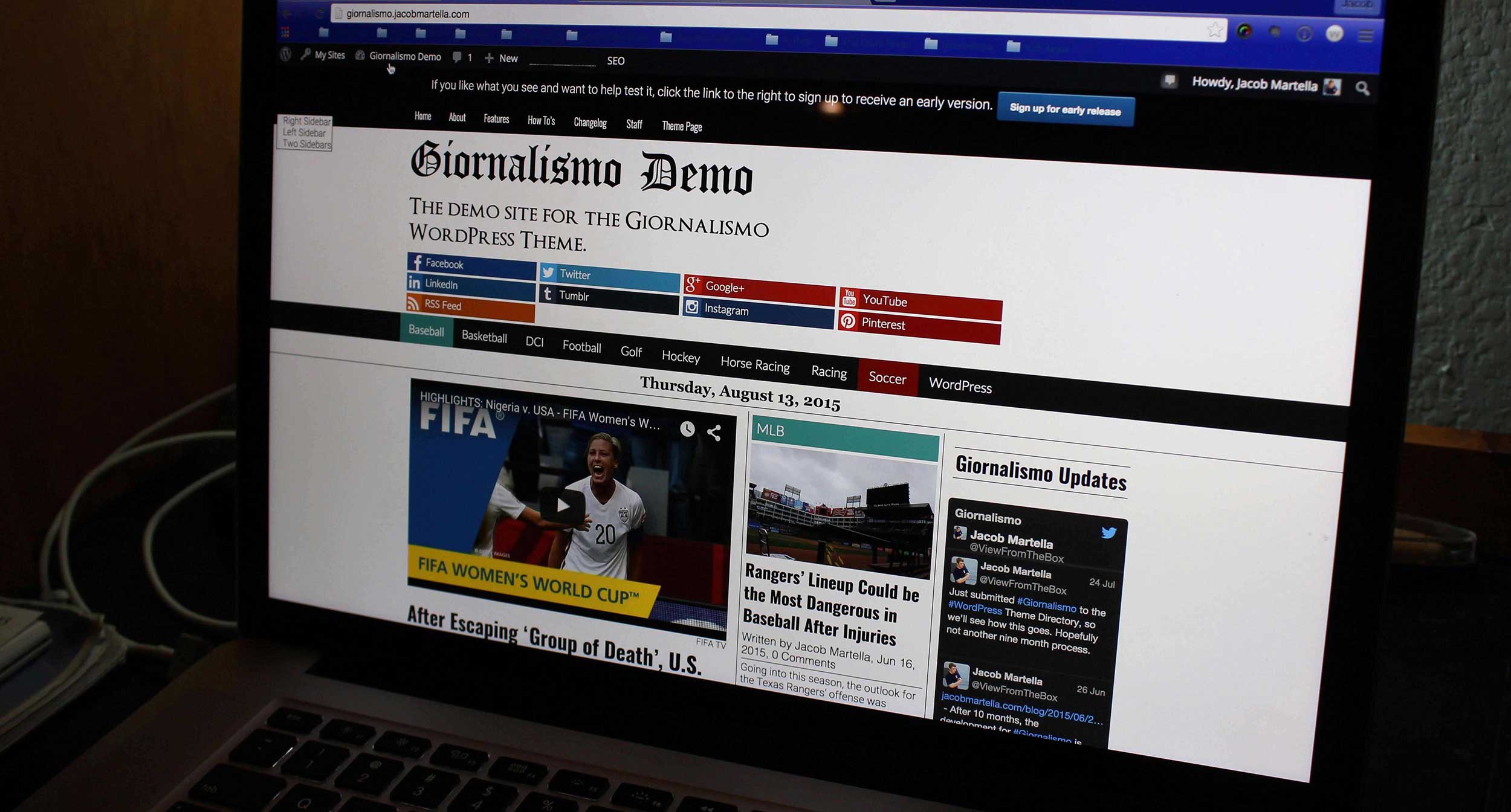
But in the meantime I’ve made the decision to go ahead with the re-write for Giornalismo.
After taking looks at the current look of the theme on the local development site, I decided that parts of it needed a bit of re-designing to make it look a bit more modern. I think I’ve reached the point with this theme where I truly know what I want it to look like. I want it to still have sort of a newspaper front page feel on the home page, but with a more modern look.
So with that, I went with a flat, “boxy” type design. I found another vector set of social images that are square and flat and the text with that will be in a box that’s slightly darker than the social media site’s main color. That sets the tone with what the other aspects of the theme will look like. Label heads will be in a box that’s black initially, but the user can change the color in the CSS if they want, and hopefully it becomes a theme option down the road.
A number of headings will also have that “boxy” feel, like the “Related Stories” title on the single post. The hope is that this will have a nice, cleaner feel than the boring design I had originally.
So this week was spent creating three mock ups in photoshop — home, single and archive (all for desktop). I only did those three since those are the most essential and I didn’t want to waste too much time with it.
So now begins the process of writing the code for it, which will likely take a lot of time as I will be very focused on coding everything the correct way. And hopefully in that time, I’ll hear back about Nuovo.


