I’ve always hated making tough decisions. There’s always that nagging feeling that the other option you didn’t make was actually the better decision.
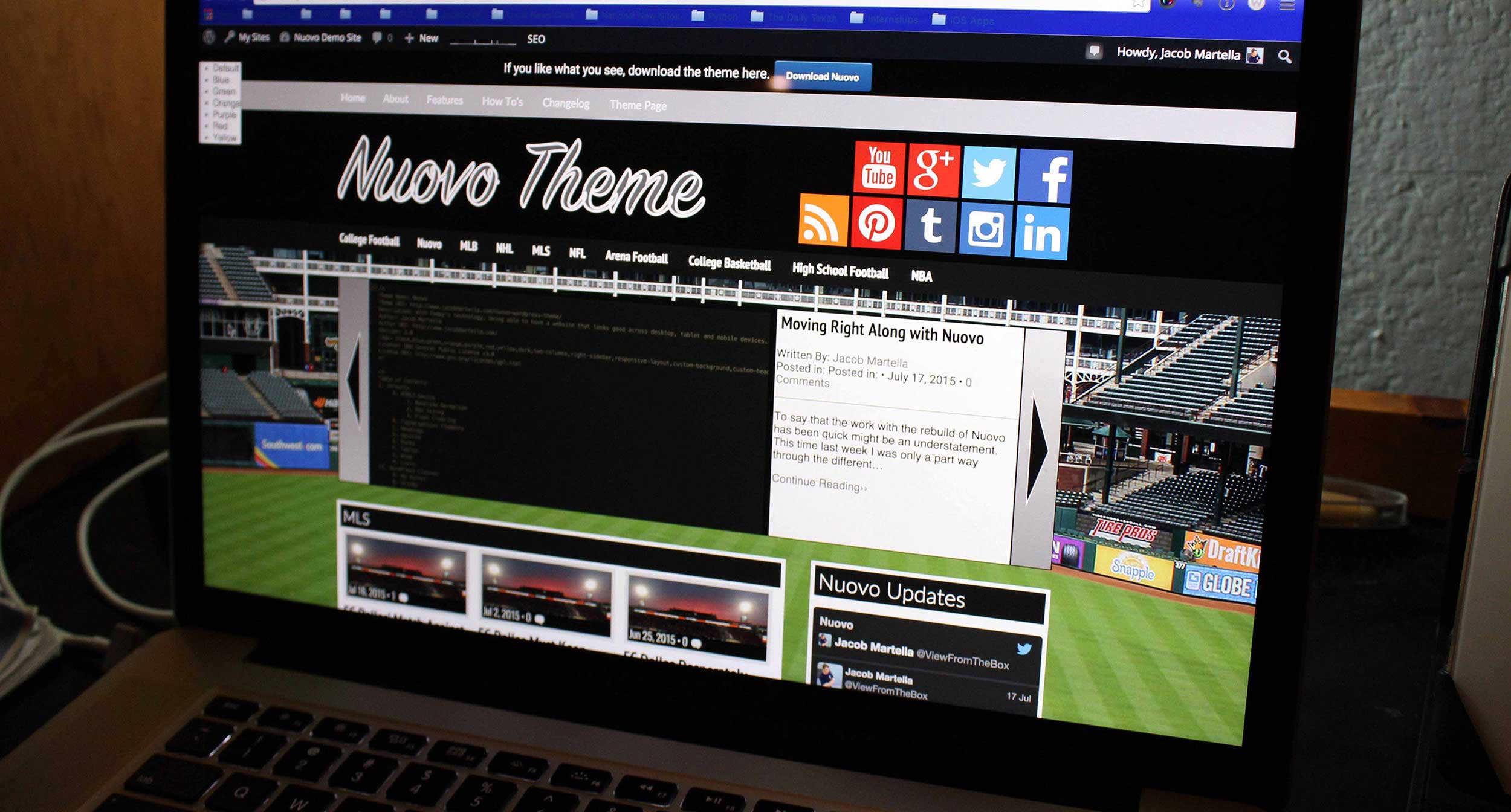
That’s sort of what I have to deal with going forward with this Nuovo theme. Right now, I’m filling the mobile styles for screen sizes between 320 pixels (the width of the iPhone and minimum width of virtually all smartphones) and 650 pixels (the lowest screen width the tablet styles can work without breaking the main content areas).
As I’m increasing the size of things going up from 320 pixels, everything’s been working fine until I’ve reached roughly 520 pixels or so. At this point, everything seems to be more stretched out horizontally, especially the swiper areas on the homepage; however, I can’t really make it look like the homepage of the desktop or tablet site because those look good with multiples of three posts per category area where as the mobile would only have room for two posts per line.
So that’s the decision I’m facing going forward. At this point, I think the plan will be to continue simply increasing the size of the mobile version and seeing with each increase how it works and looks and making decisions on whether to change it or not as I go along.
But once this is finally over with, I’ll basically be home free. There are a few things that need to be fixed up. There’s a (hopefully) simple fix needed to the editor style and then I’m looking to change the way tags look in the tag cloud widget. Finally, I’ll go through the code once more before sending it off to the WordPress theme directory where it hopefully will get accepted.


