So you have a product or service you offer and you’re starting an online ad campaign for them. But you need a place on your website for those ads to point back to. What do you do?
That’s where a landing page comes in.
A landing page is an entry page to your website that people come to from an online ad to learn more about that product or service and start what’s known as the customer’s journey with your business. Sometimes it’s your homepage. Sometimes it’s another inside page.
But no matter where it is in your website structure, your goal with this page is to get people to convert from passive visitors to interested leads or paying customers. And you only have a relatively short time to do so. So this page is vital to your website and your business.
So, let’s break down some of the main parts of a landing page to help you create one that’s going to help your conversion process.
The hero image/section
The first thing that anyone will see on the landing page is the hero image or section. And it’s your first chance to make a good first impression.
Sometimes there’s an image taking up the entire screen or off to the side or there might be an illustration. Or sometimes there’s a form in this area for people to sign up for something. But there is always text here that advertises what this page is about and what action you want the visitor to take.
The goal is to convice the visitor to stay on this page and to scroll down to learn more. You need to make sure your text and images (if there are any) are enticing enough for people to want to find out what you’re talking about. You don’t have to give it all away right at the top, but make sure you create enough intrigue.
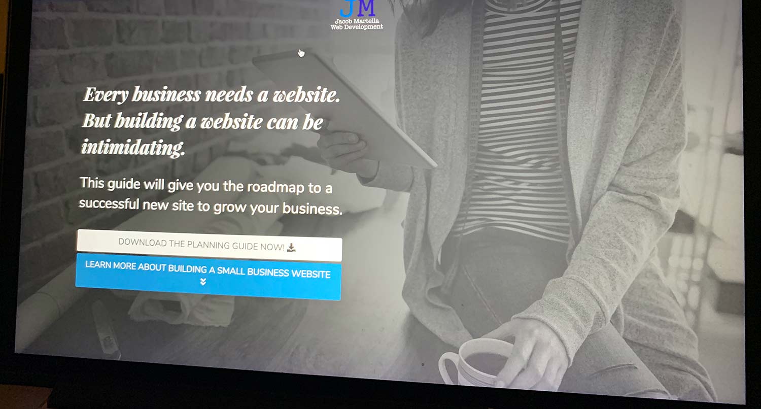
For example, the “Small Business Website Planning Guide” landing page on this website teases a way to help business owners walk through the steps of building a new website. But the real content of it all comes later down the page.
Either way, the hero section is your first opportunity to get people to convert, whether that’s purchasing a product, signing up for an email newsletter or learning more about your service. So make sure it’s the strongest part of the page.
Now, if you’re wondering about why this section is called the “hero” section, apparently it comes from the theater world. But that’s another story for another time.
Calls to Action
While the hero image is the most important visual part of the page, the call(s) to action (CTA) is/are the most important function of the page. This is how you actually get people to convert from just visitors to interested leads.
There are two keys to a good CTA. First, it must stand out on the page. It can not be just a simple link; it has to be a button. And the button must have enough contrast from the items around it so it doesn’t get lost in the sea of the page.
And the second is that the text on the button needs to be convicing. You can’t just have “Read More” or something like that. It needs to be an action, hence the name “Call to Action”. Using phrases like “Purchase your spot today!” and “Start building the website of your dreams!” are excellent because it clearly defines what the button will do and it can get the user excited about what’s next.
Plus, you can have multiple CTAs on a page. For example, my hero section for the WordPress plugins and themes I offer have a download CTA, learn more CTA and the themes have a “View Theme Demo” CTA. So it’s perfectly fine to have a number of them on the page. Just make sure they aren’t conflicting with other messaging on the page and don’t confuse the visitor.
But, as I mentioned above, the CTAs on a landing page don’t have to be a simple button. In fact, you’re probably going to want to have a form on that page to collect information. Unless you’re using this page to get people to add a product to their cart, you’re going to want people to sign up for something. So play around with a form on the page and a strong call to action to get people to sign up for it.
Tell the Story of Your Small Business With a Website
Every small business has a story. And every small business needs a website to help tell it. A website allows people to find you online, serves as a home base for any marketing effort and can help you tell the story of your business. So if you’re ready to give your business its first website or are ready to take your site to the next level, let’s get started on making that happen.
Let’s Get Started on Telling Your Story With a WebsiteContent will always be king
Finally, content will always be a vital part of any landing page. You can have a beautiful hero section. Your calls to action can stand out and have the right text on them. But if the content is weak and doesn’t explain what the product or service is, then none of the above matters.
You content here, from other photos to the text, needs to explain what this product or service is truly about. You need to create an informative sales pitch. By the time the visitor gets to the final call to action on the page, they should know what they are getting into when they click that CTA.
This is so vital, it might be worth going out and getting a copywriter to help you out with it, especially if you’re not really a writer. They’re going to know exactly what to say and how to say it to get people more and more interested in what you’re offering.
Because at the end of the day, the content is going to get people to convert. And you’re probably going to be spending the most time here.
Examples
So now that we’ve talked about the important elements of a landing page, let’s look at a few examples to help spark your inspiration.
This website
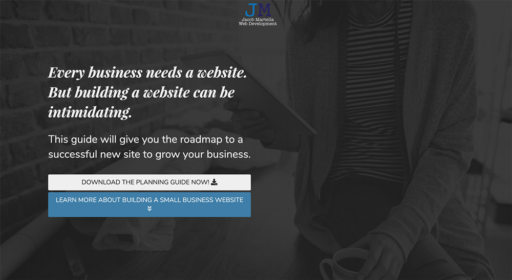
So like always, let’s start on this website with the “Small Business Website Planning Guide” page. Here, the hero image takes up the entire screen. The calls to action relate to either learning more about the guide or going right to the form to download the guide. The text let’s you know exactly what the purpose of this page is: to give you a guide on building a website for your small business.
And the text sections are all centered around that goal. Whether it’s the intro section, talking about if the person needs a new website or the steps in building a website, it’s all about getting the visitor to want to sign up to get the guide to help them.
Google Cloud
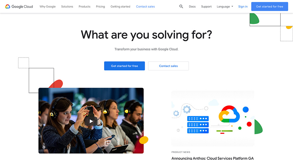
This landing page from Google Cloud is a great example of a hero image-less landing page that still keeps the visitor interested. The headline asks an interesting question, “What are you solving for?” to make us really think about our intentions. And the calls to action are right there at the top and are clear about their actions.
And then the rest of the sections talk about Google Cloud, their services and what people think about it. There’s enough convincing information to help visitors make a decision on whether to continue or not.
Microsoft
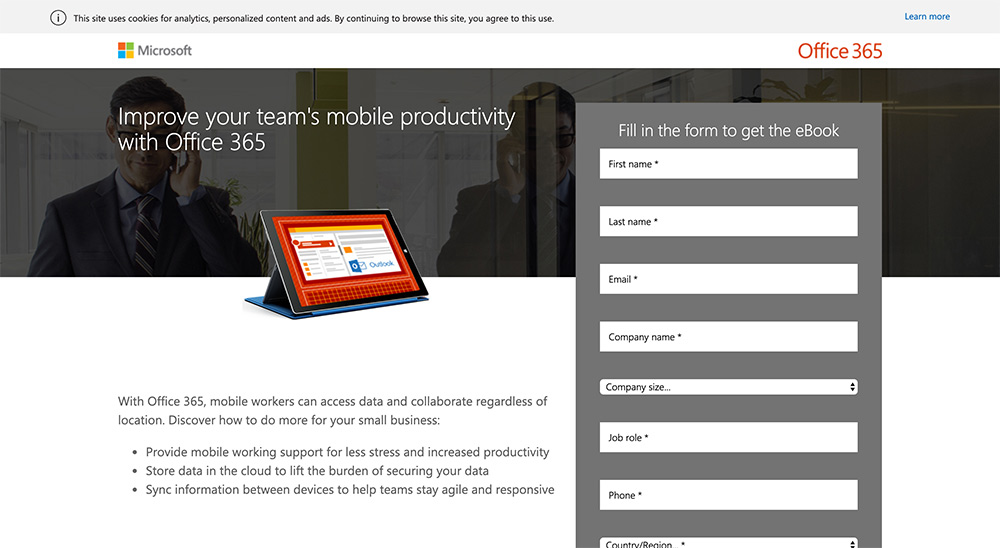
Microsoft’s landing page for Office 365 is minimalist to the nth degree. There’s not a lot on this page. Just a small-ish hero image with a simple headline, some points and a form as the call to action.
But there doesn’t have to be. You probably know what Microsoft is what and what they are offering. And they just give you the information you need. No more. No less. And sometimes less is more.
So if you’re looking to build out a landing page for your website, take these things to heart. Focus on your hero section, calls to action and the content on the page. Remember, the goal is to get people to convert. Otherwise, it’s just another pretty page.

