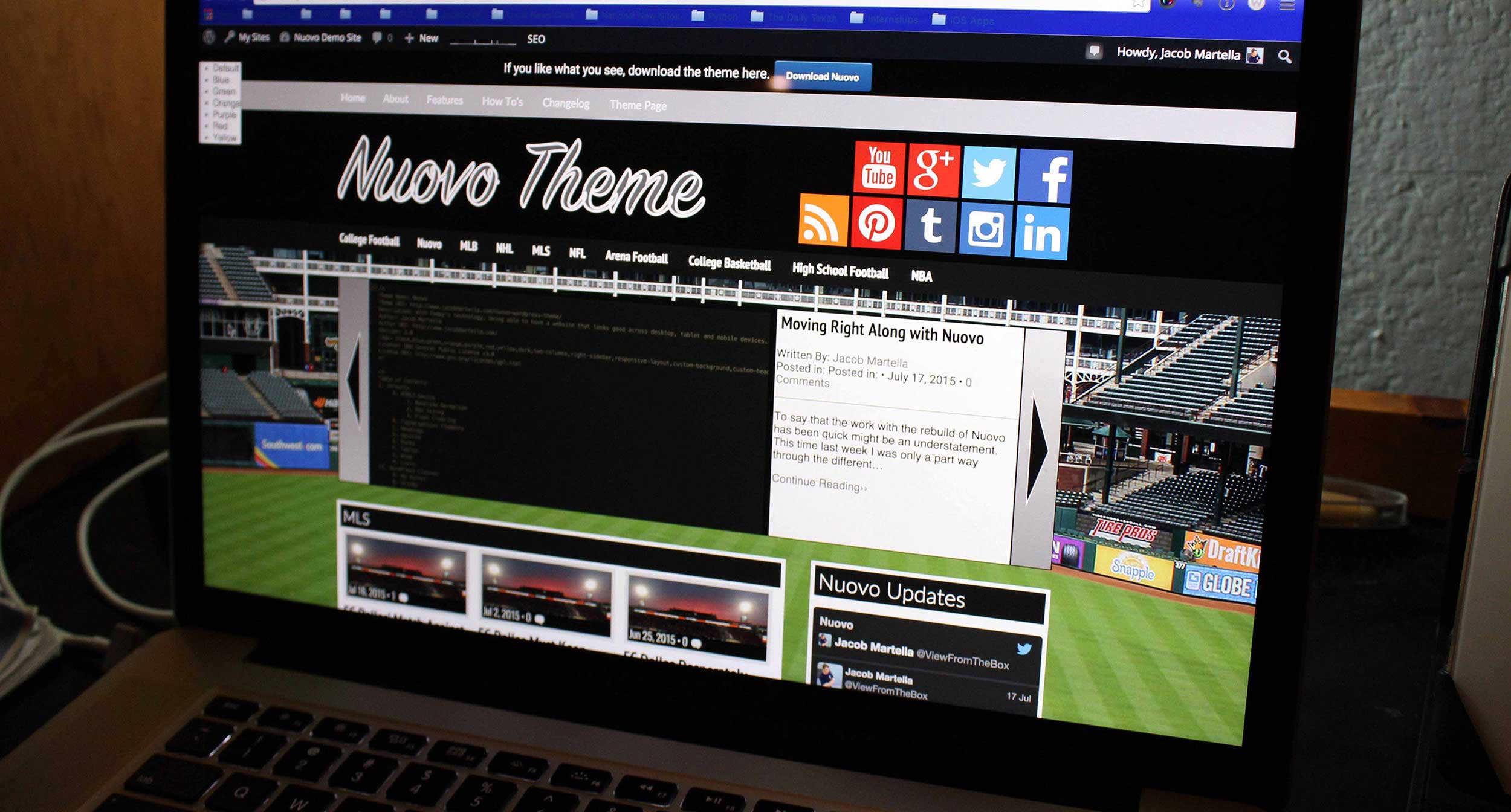
So formatting the theme for tablets turned out to be way easier than what I was anticipating. Essentially all I had to do with it was divide the sidebar into two and put it under the main post area. Also, I moved the social icons to under the header and had to eliminate one of the icons for the time being to make it all fit.
I also ended up darkening some of the colors so it’s not quite as blinding, especially if the user wants to use the orange, purple, red or yellow theme. The yellow still jumps off the screen as really bright, but if someone wants to use that color scheme, they’ll be able to find the appropriate colors.
Finally, I went outside the comfort zone and sort of dove into the Twitter API and create a Twitter widget for the user. Unfortunately with the way the Twitter API works nowadays, the user will have to create an “app” and get four keys/tokens to use the widget, but it will be easier for the user to customize if they so chose.
So now begins the probably long journey into designing the mobile theme. With the obviously smaller screen, nearly everything has to be redone to fit in. It will have to include two mobile menus, which is one of the harder things I’ve done in coding, a smaller featured post slider and swiper-enabled homepage post area.
That ought to keep me busy for a while.